2020-21 OHC Website Redesign
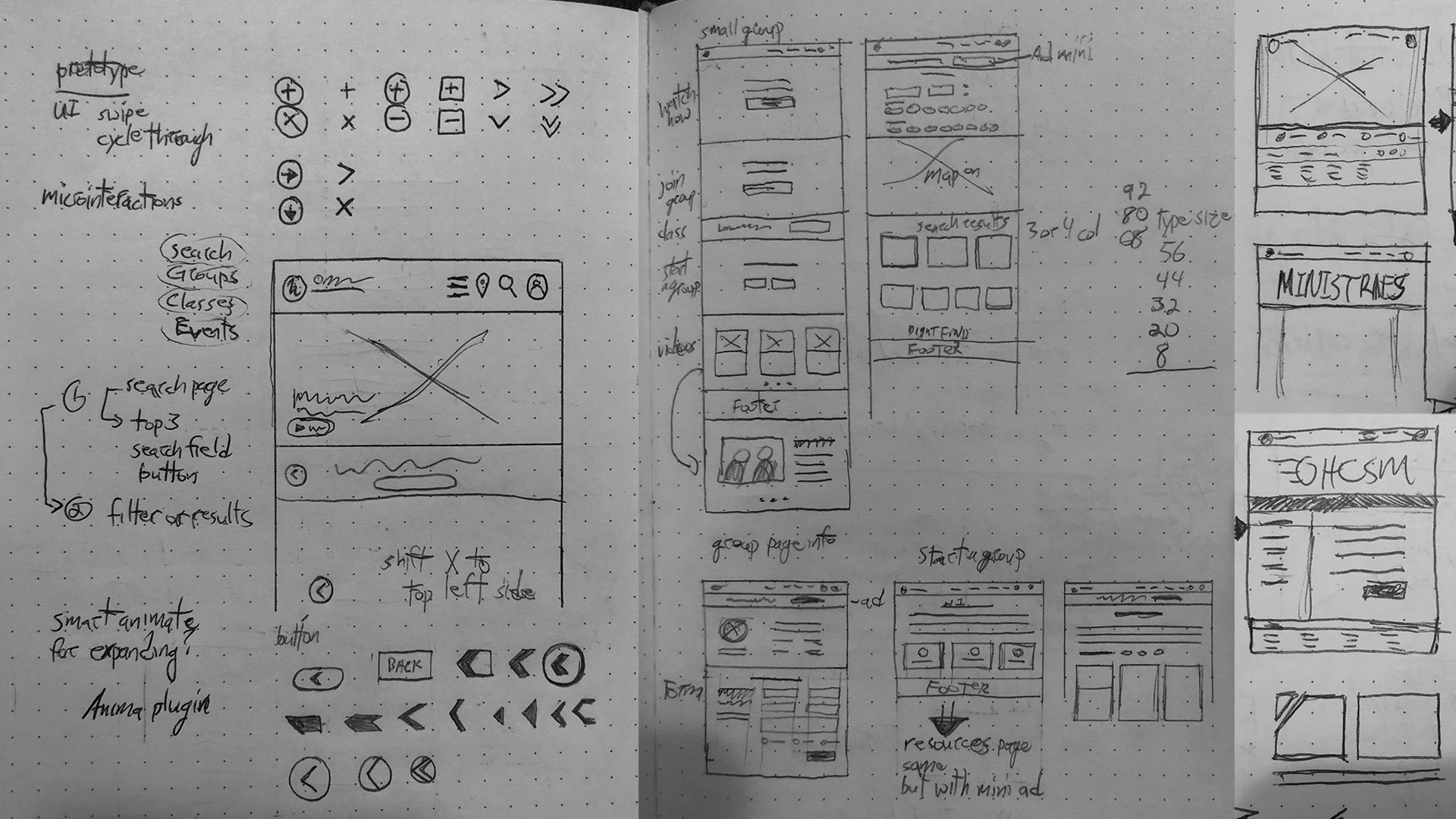
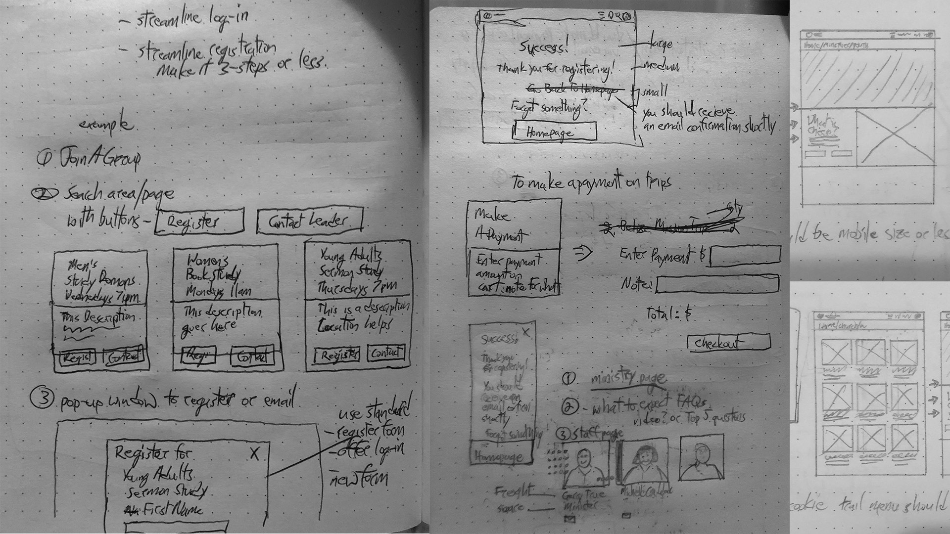
Around the end of 2019, the team and I started discussing redesigning our website (oakhillschurch.com) for the second or third in a few years. In November, I began playing with Figma at the behest of a former co-worker and see if there would be any benefit to using it. Fast forward to late January-March 2020 and the need became more apparent for OHC to shift like the rest of the world to a more user friendly website. Our website was seriously lacking in a lot of ways for users, staff and whoever else used it. Coupled with my newfound joy and minor experience in Figma, my team and I began meeting and wire-framing an entirely new web design and experience. Now keep in mind that we were also forming a new brand alongside this process, so a lot of wet concrete was around. There were countless Teams calls and screen sharing sessions with lots of vigorous debates about what should go where and why. I would go off on deep research dives for given problems that needed solutions hoping I could find an easy, executable solution given the parameters and boundaries of our CMS system. I'd call our web guy and ask him "Can I do this?" or "What do you think about this?" and we'd end up in a 30 minute conversation problem-solving together. Right after the call ended, I'd go spend an hour or more just watching Figma tutorials and experimenting within Figma to create the experience we dreamed up. I spent hours sketching layouts and user flows that I could replicate in Figma and then present to the team for feedback. Put this cycle on repeat from my apartment bedroom and after almost a year and a new baby showing up, that is how I worked on this redesign.
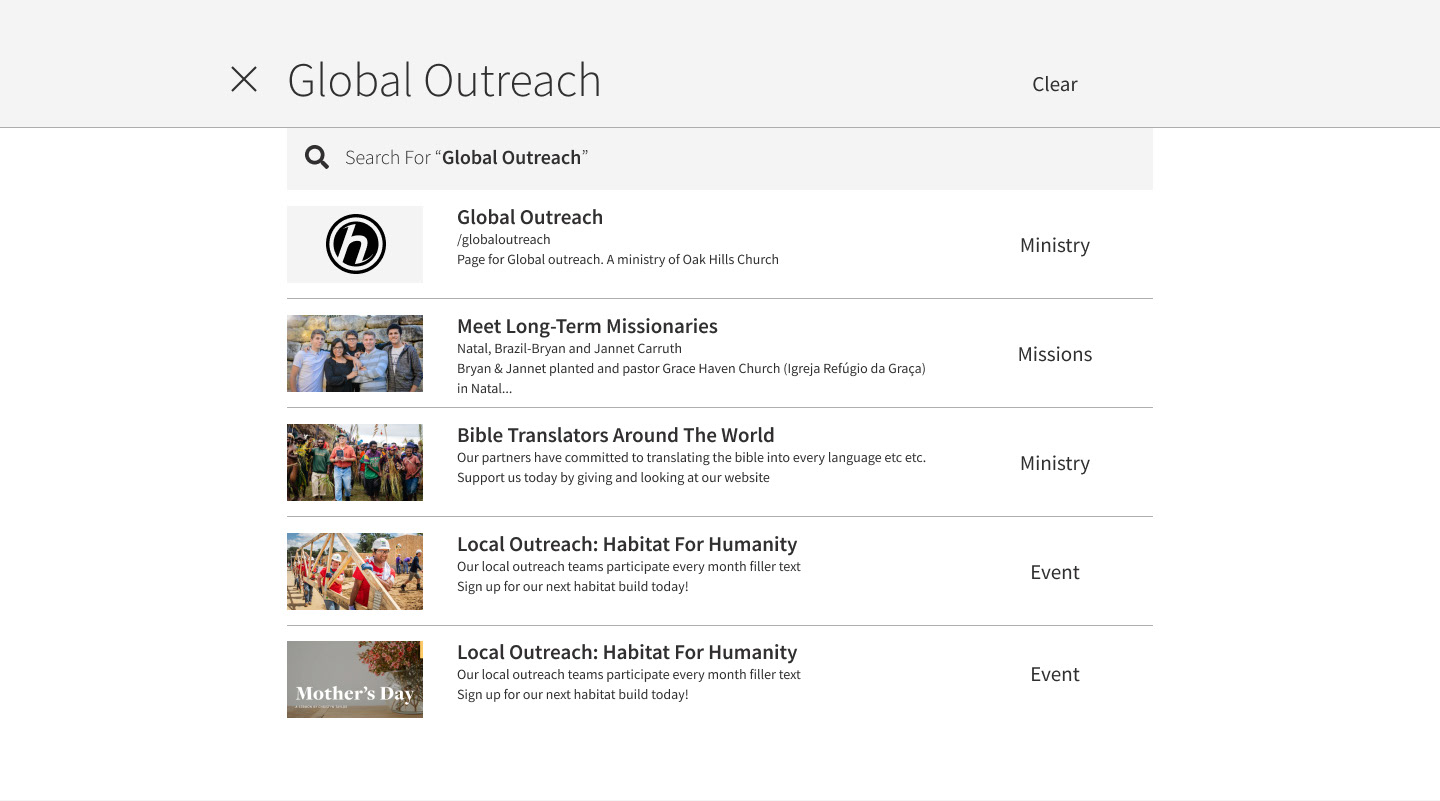
I've put some Figma prototypes at the end of this project to let you experience what we did as I sent them out to our third party web developers. We didn't use Wordpress because as a church we'd shifted away from it to a non-profit / church-based CMS called Rock CMS. Rock presented a lot of pros and cons that ultimately shaped the end product. The translation from Figma to developer was about 90% and that was much better given my previous experience using Photoshop files. A lot of inspiration was taken from other church websites and even some corporate brand systems such as Newspring Church, Southeast Christian Church, LifeChurch, Vous Church, Loom, Hulu and Meetup.com. It was a very rewarding experience and I know from a metrics standpoint, we've had more engagement on the Contact forms and the registration process is easier, despite that being completely out of my control. Leadership and staff embraced the new design and overall experience as well. There's a system in place that allows for expansion and that was a goal I wanted to achieve throughout this redesign because our previous site suffered from what we called "frankensteining." There were a lot of hands adding/breaking the site on the backend, so we took a step back from that in this new iteration as well. It's not perfect but we've reduced many headaches and surprises across the board.
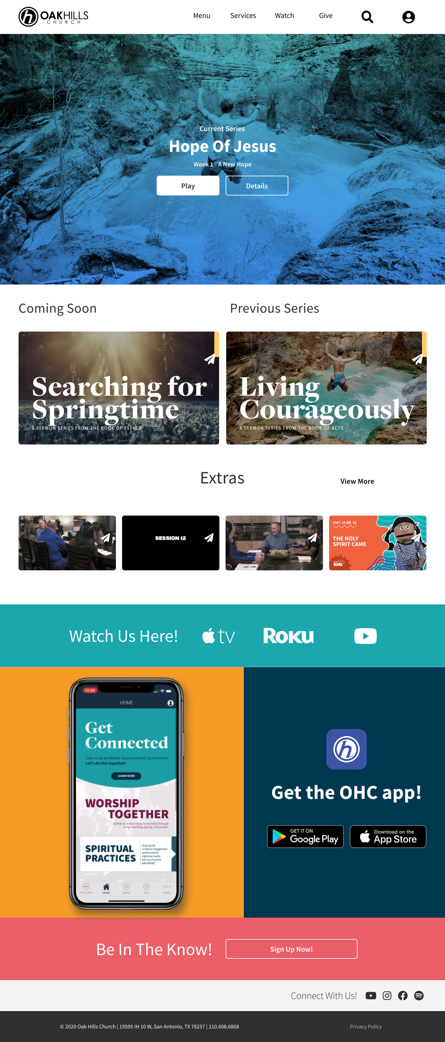
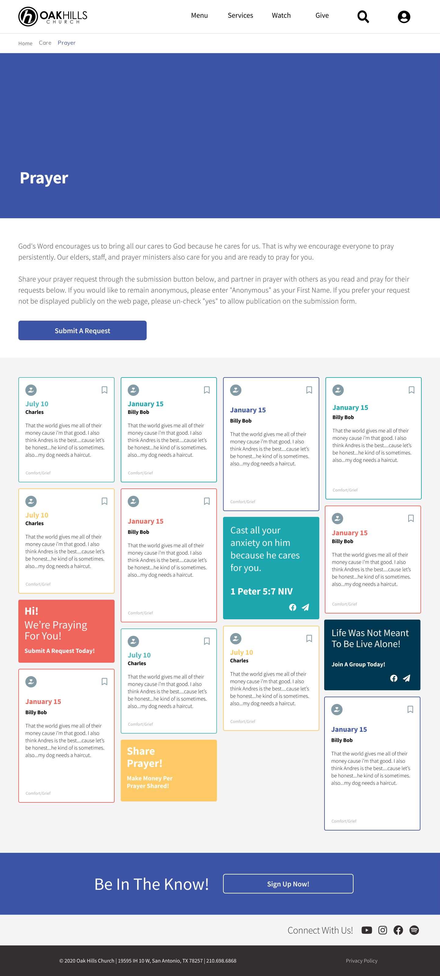
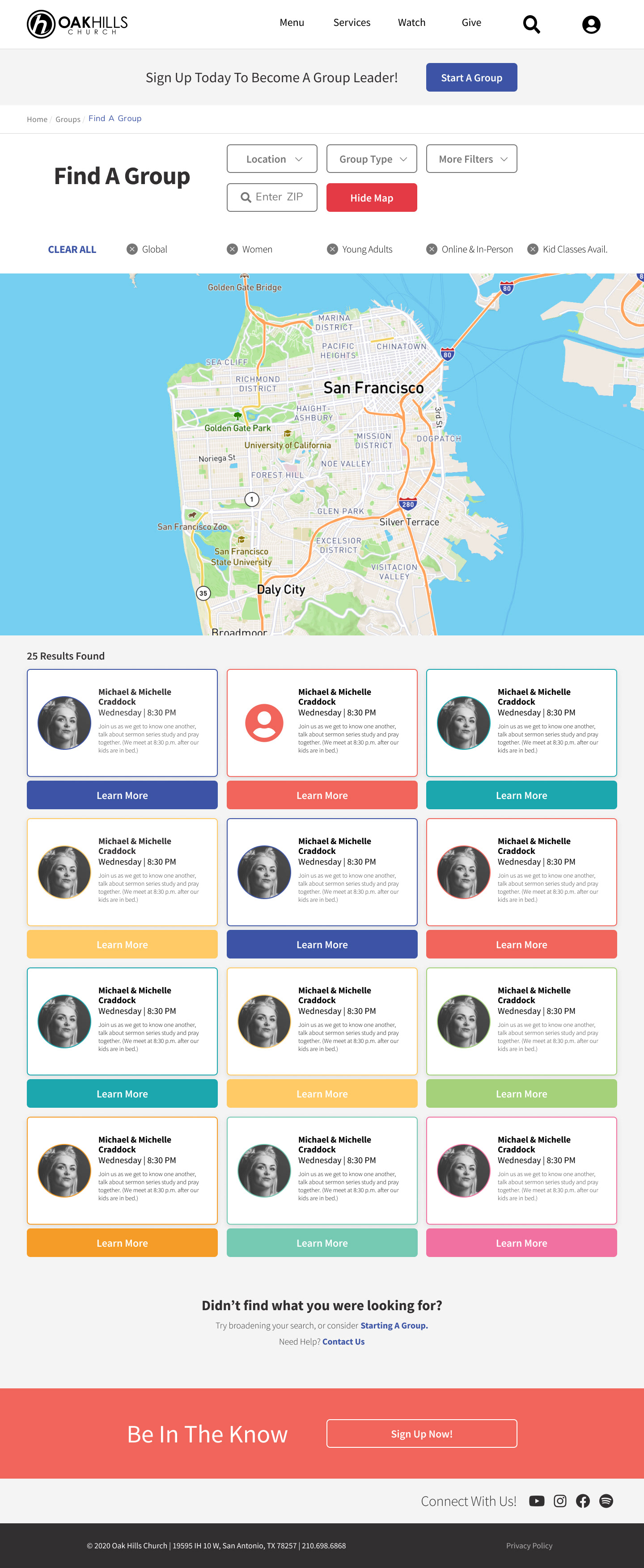
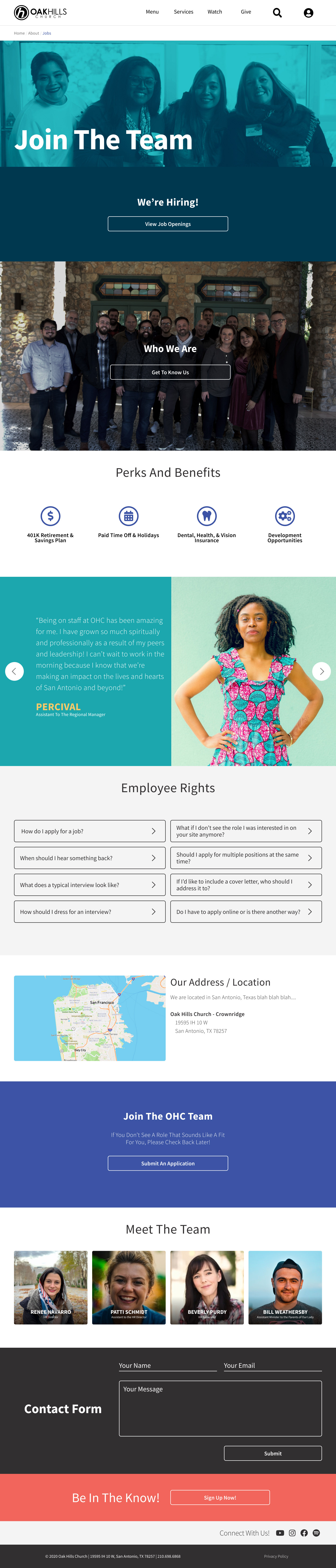
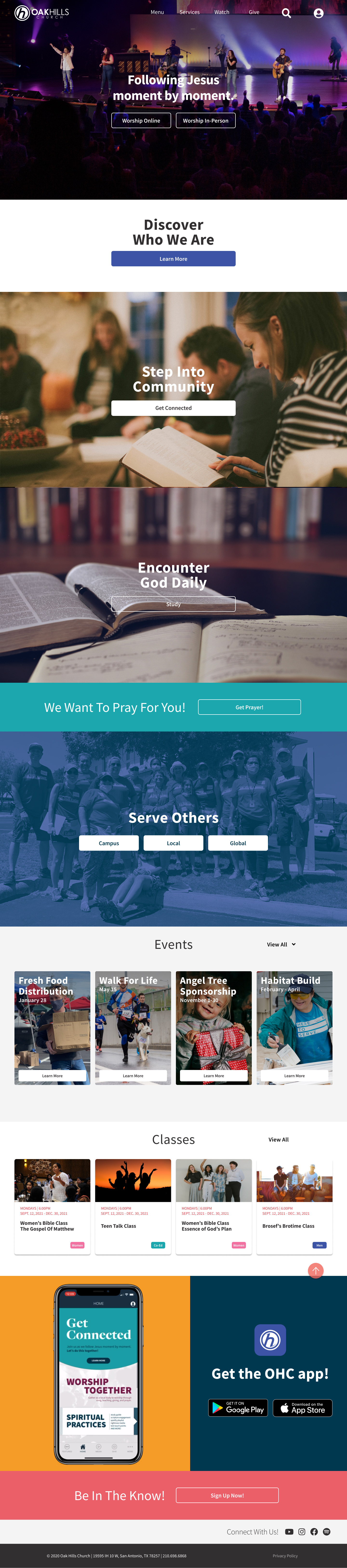
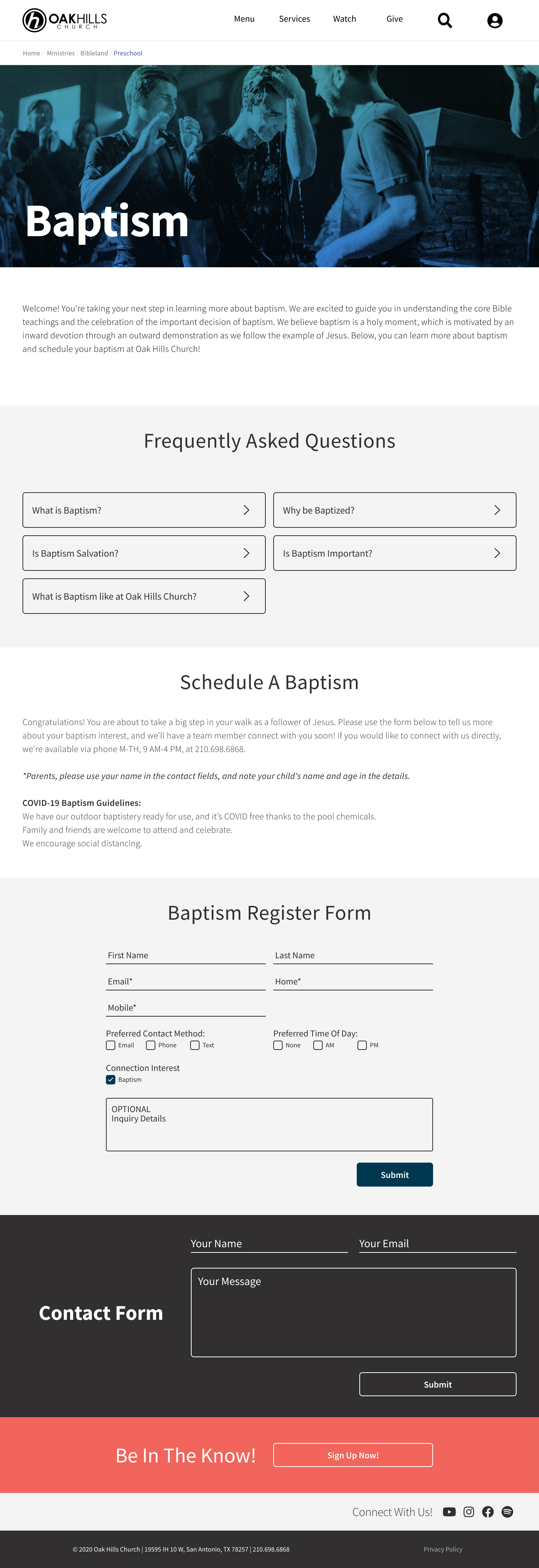
Guess I should point out that I developed a "block" system for this site where you could add/remove blocks to most pages as needed. Different blocks performed different tasks but did them well and offered a good bit of customization but not too much. Each ministry (client) had the ability to build out their own page in a unique way so most pages are unique in layout but without sacrificing the overall visual identity in the process. Since we had a video block, we could add a series of videos to any ministry page and it not affect the overall media page, which has now shifted to Vimeo OTT, but even that service carries the spirit of what we were aiming for with the design.
Anyway, hope I didn't bore you with my little narrative about the process and thoughts behind the design. Cheers!
I've put some Figma prototypes at the end of this project to let you experience what we did as I sent them out to our third party web developers. We didn't use Wordpress because as a church we'd shifted away from it to a non-profit / church-based CMS called Rock CMS. Rock presented a lot of pros and cons that ultimately shaped the end product. The translation from Figma to developer was about 90% and that was much better given my previous experience using Photoshop files. A lot of inspiration was taken from other church websites and even some corporate brand systems such as Newspring Church, Southeast Christian Church, LifeChurch, Vous Church, Loom, Hulu and Meetup.com. It was a very rewarding experience and I know from a metrics standpoint, we've had more engagement on the Contact forms and the registration process is easier, despite that being completely out of my control. Leadership and staff embraced the new design and overall experience as well. There's a system in place that allows for expansion and that was a goal I wanted to achieve throughout this redesign because our previous site suffered from what we called "frankensteining." There were a lot of hands adding/breaking the site on the backend, so we took a step back from that in this new iteration as well. It's not perfect but we've reduced many headaches and surprises across the board.
Guess I should point out that I developed a "block" system for this site where you could add/remove blocks to most pages as needed. Different blocks performed different tasks but did them well and offered a good bit of customization but not too much. Each ministry (client) had the ability to build out their own page in a unique way so most pages are unique in layout but without sacrificing the overall visual identity in the process. Since we had a video block, we could add a series of videos to any ministry page and it not affect the overall media page, which has now shifted to Vimeo OTT, but even that service carries the spirit of what we were aiming for with the design.
Anyway, hope I didn't bore you with my little narrative about the process and thoughts behind the design. Cheers!