Quick Background
In 2018-2019, the design team and I started on the long journey of updating and creating a more cohesive visual identity for Oak Hills Church. We moved away from 4 weights of Trade Gothic to the entire Source Sans Pro family paired with Freight Display Pro. We created a color palette that would span across multiple seasons, vibes and whatever else we'd need down the line. We also created patterns and visual elements. It wasn't set in stone, but it was a huge leap forward for our team. Then we began the deeper journey of figuring out how it all fit together by creating and creating until things started to emerge. With COVID's arrival and our work-from-home status, I really got a sense of what was working and what wasn't. We ended up focusing on our website home page the most and from that began a year long journey into Figma and a complete rethinking / redesign of how we wanted the site to operate given the features and limitations of our backend use of Rock CMS. (The website will have to be a separate project.) But from that entire process was birthed a newer look but honestly, it's a reinforcement of what we were kind of already doing.
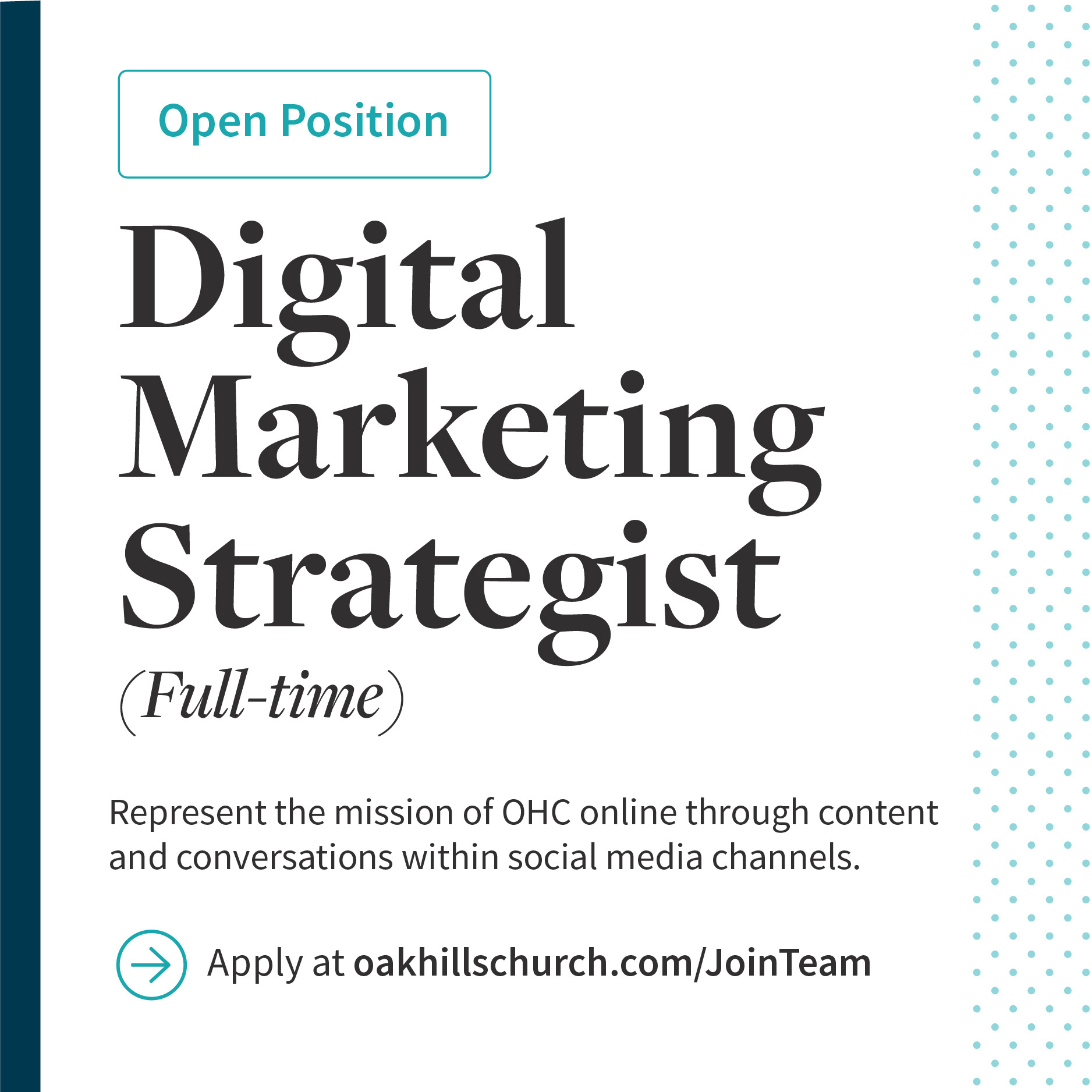
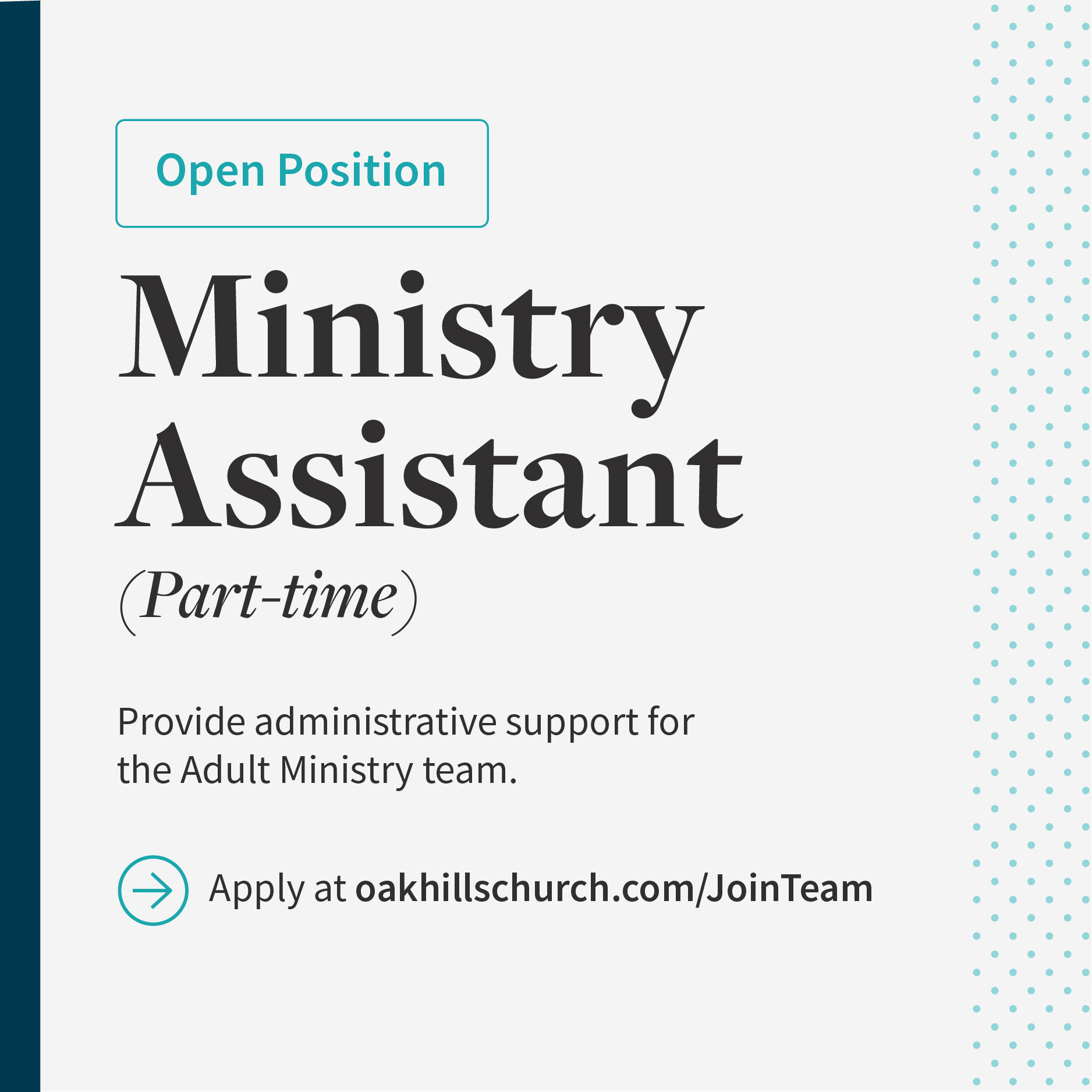
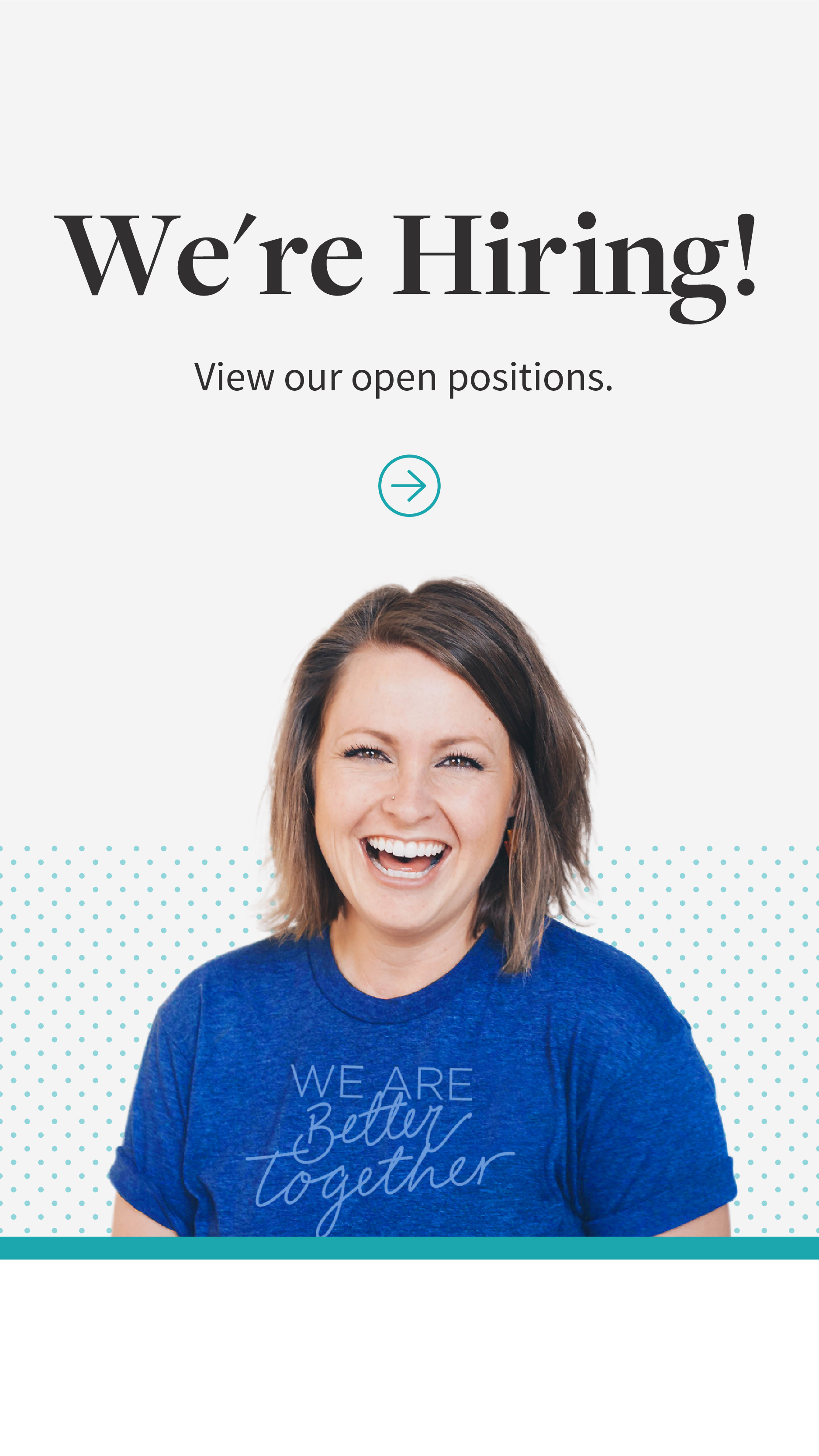
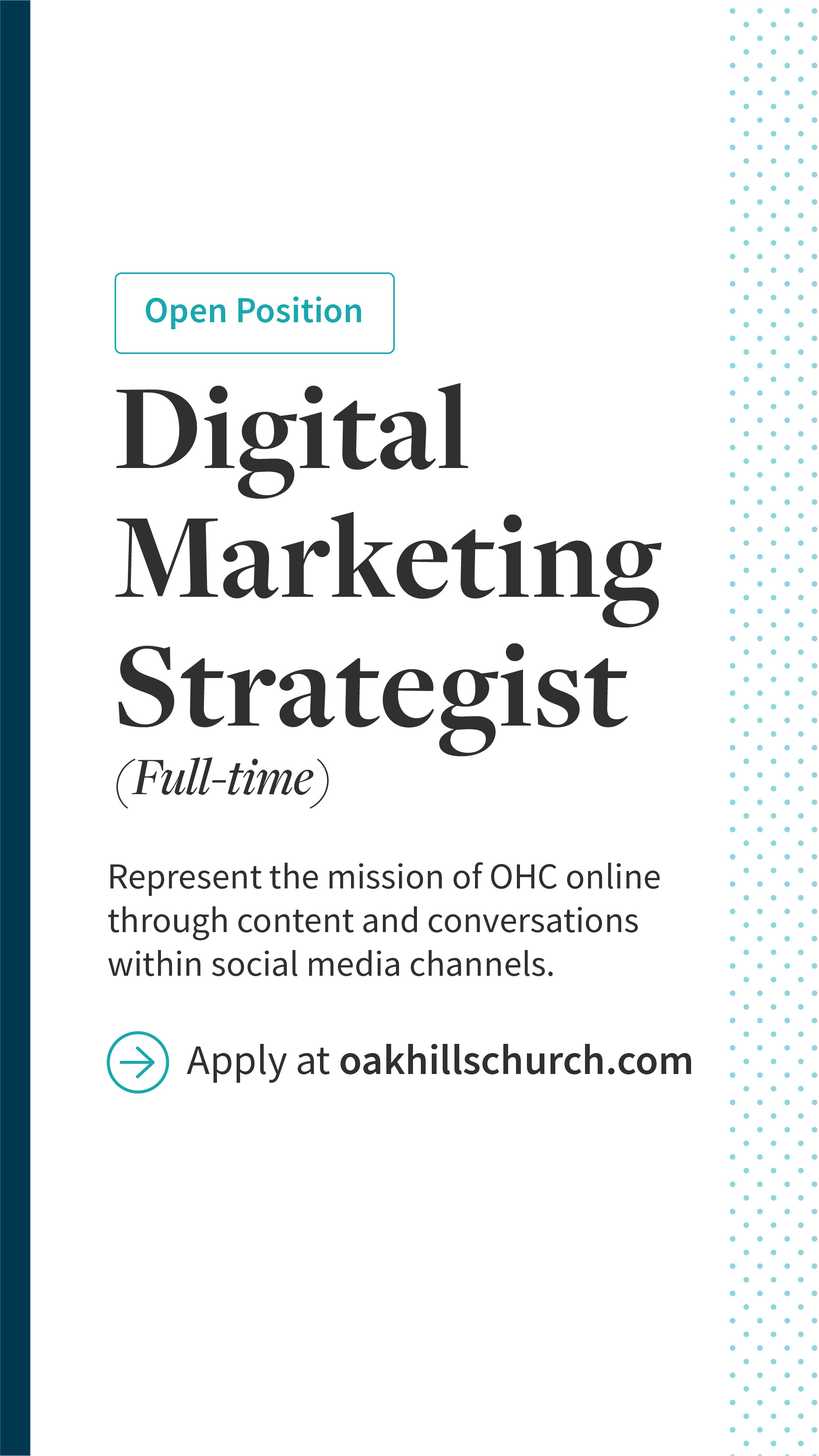
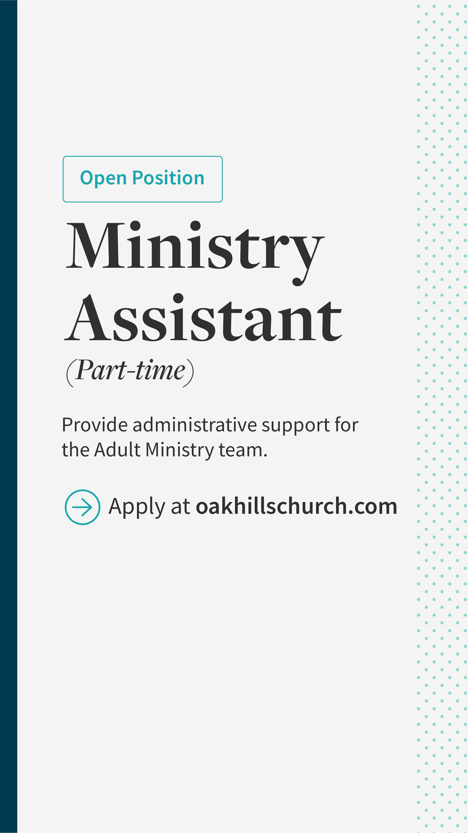
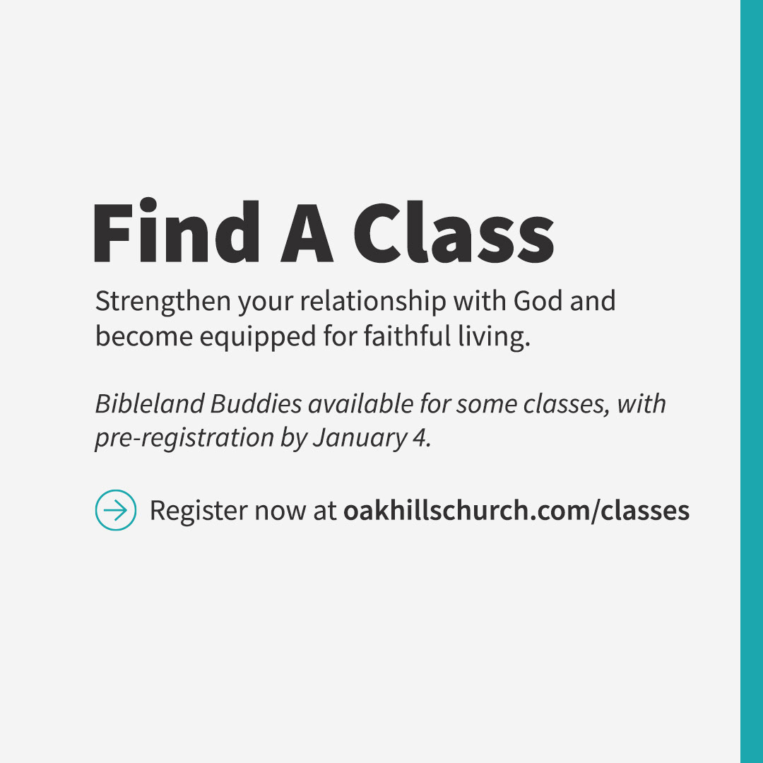
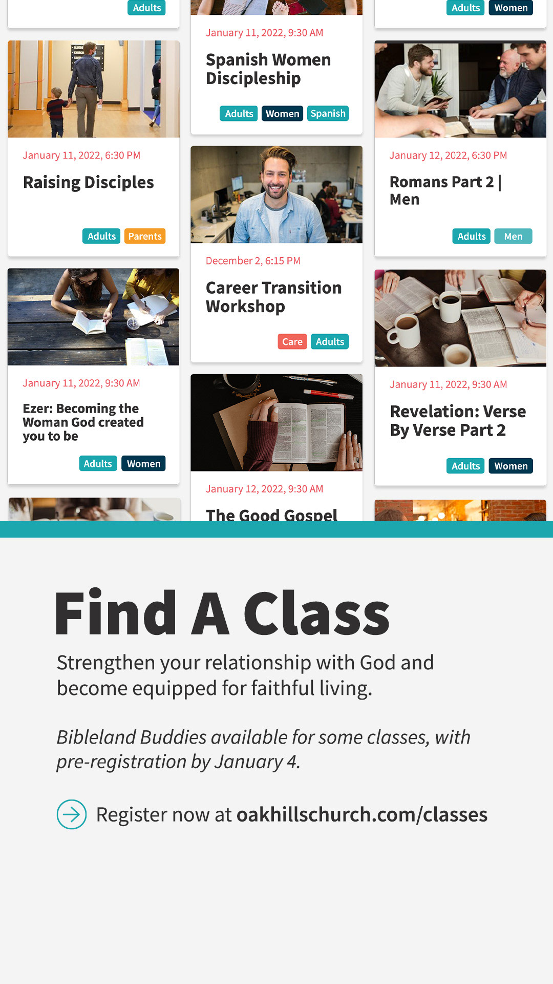
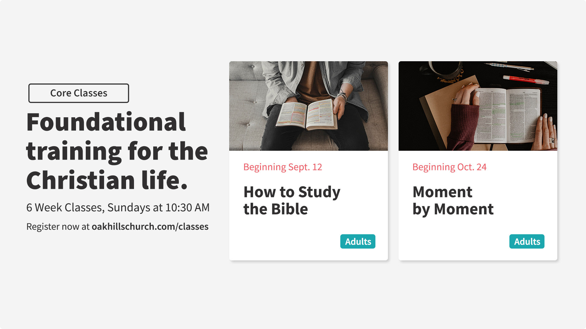
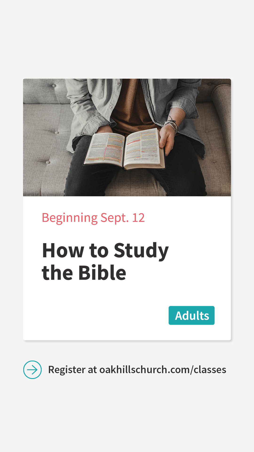
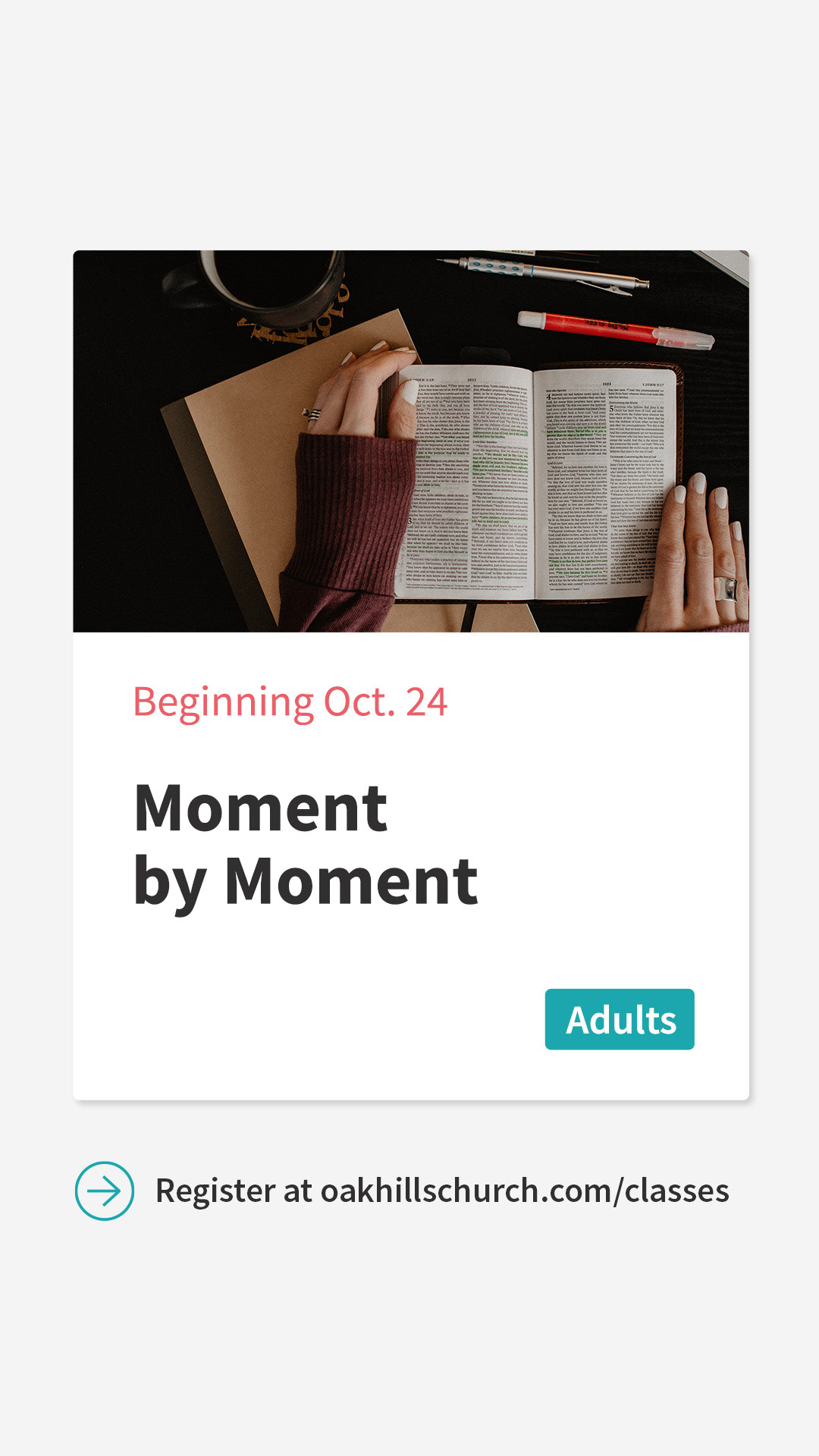
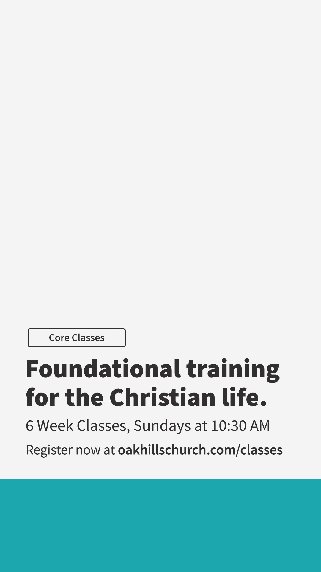
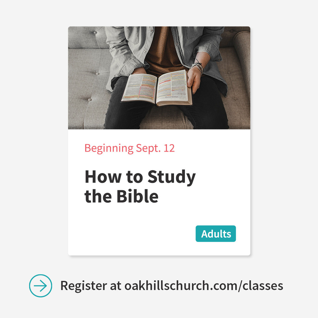
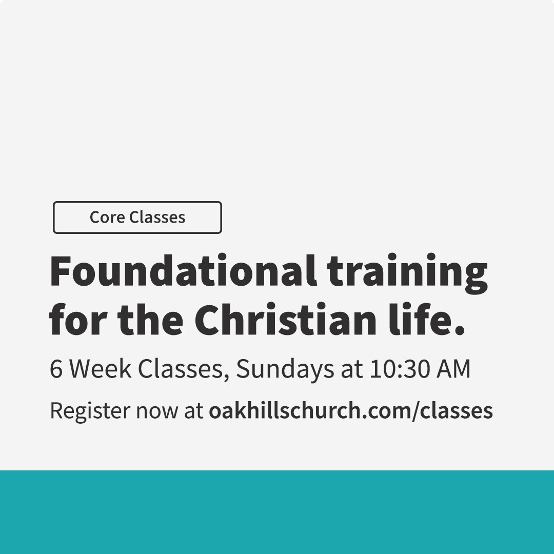
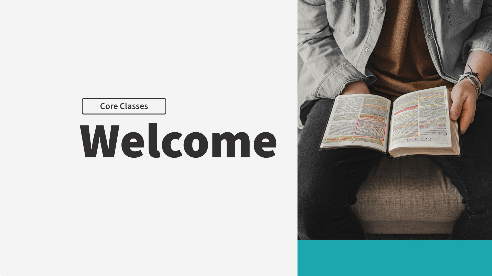
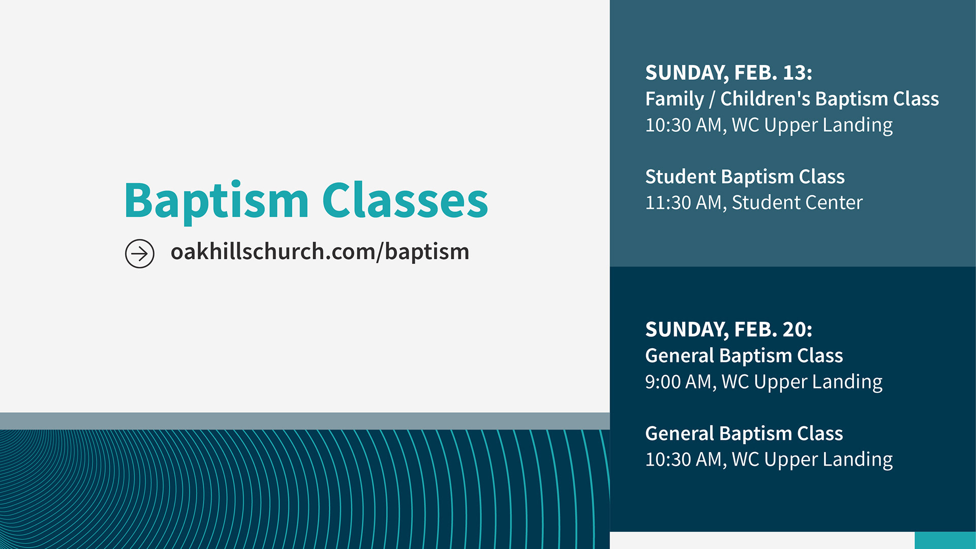
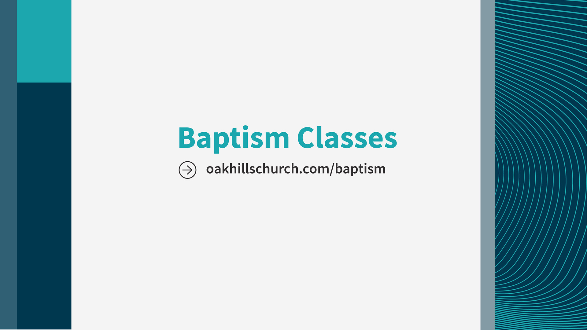
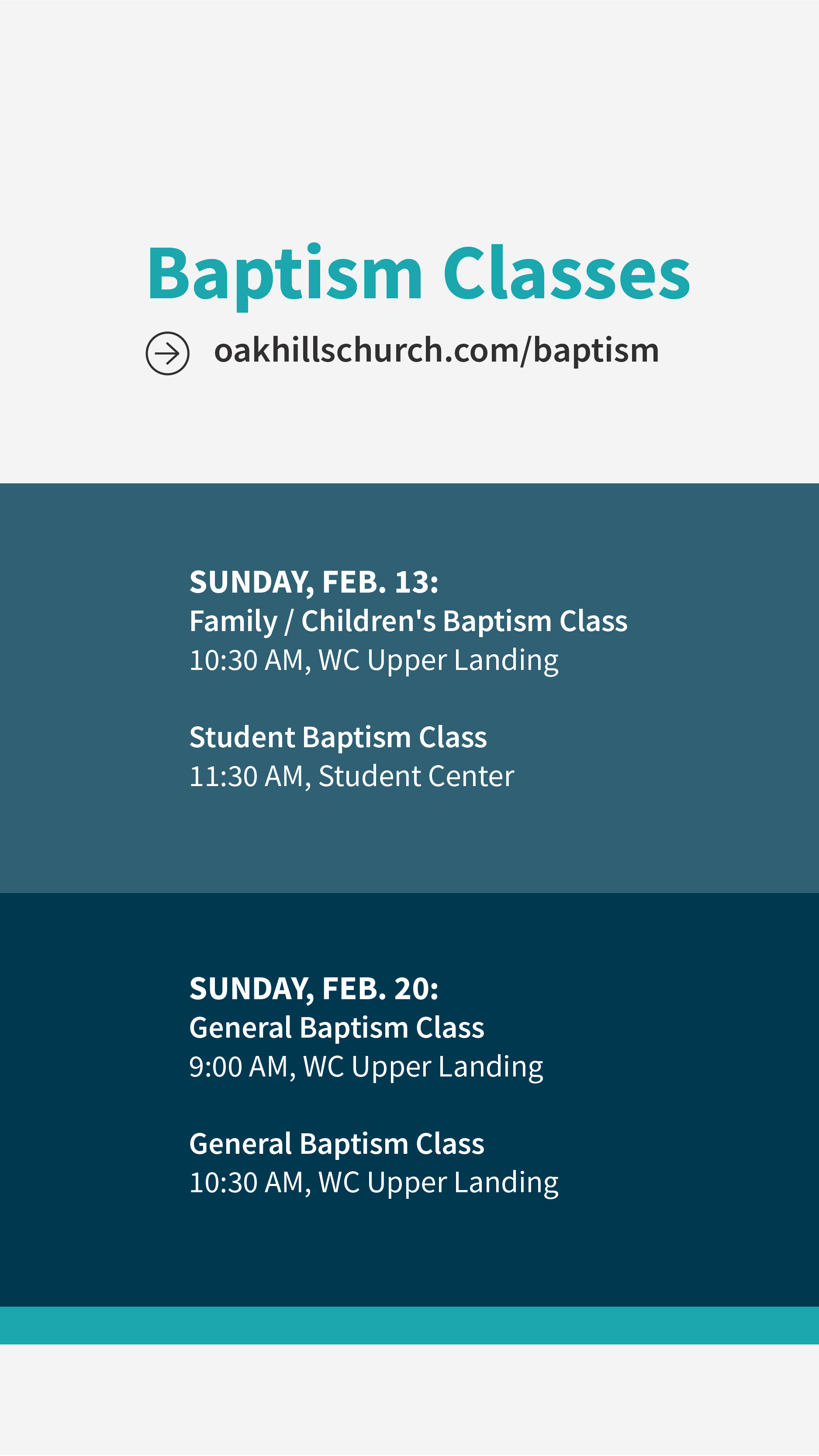
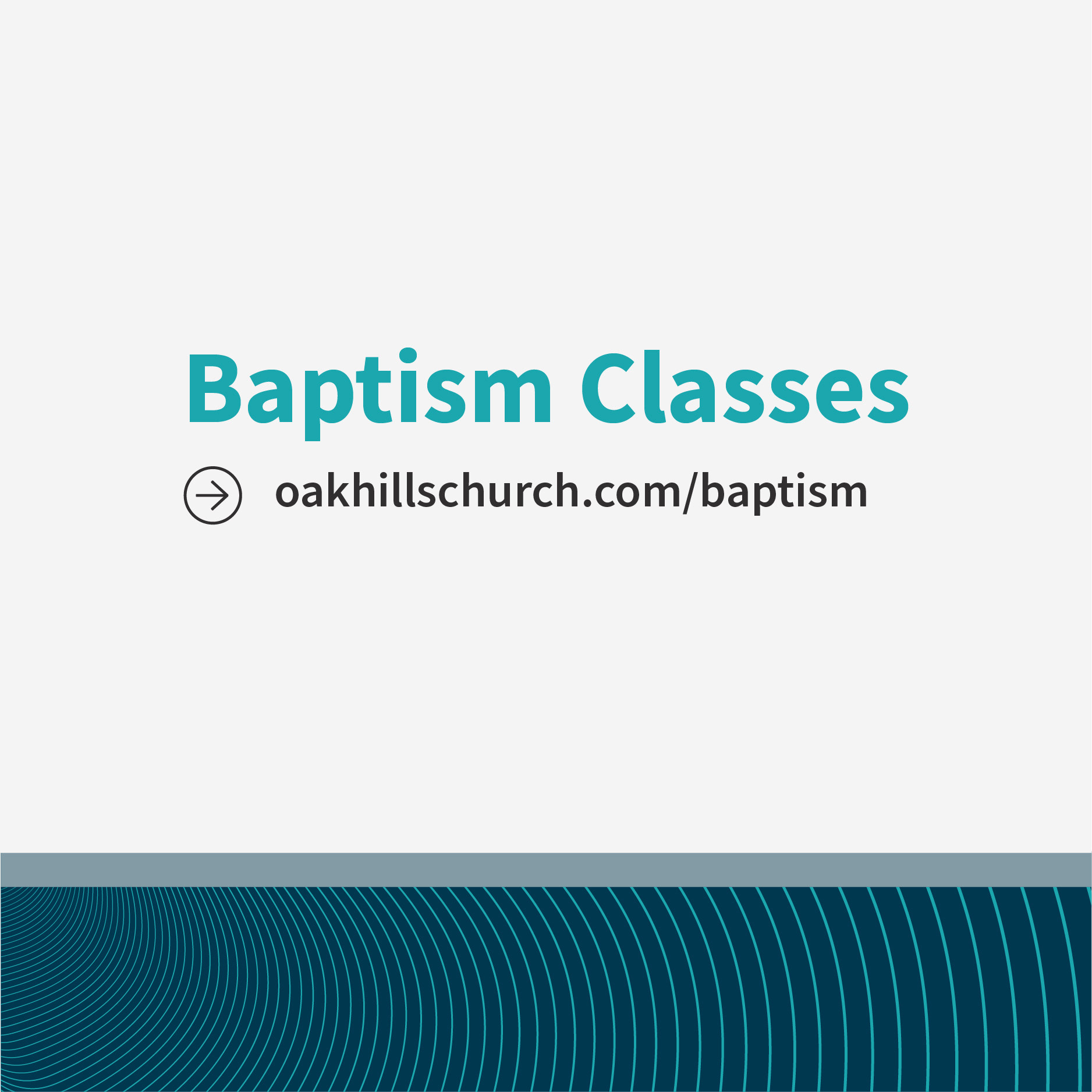
After looking at some new branding / visual ID launches in various industries, I felt like the website I'd just developed had given me a foundation to work off and push things forward for OHC's brand. So I created an 8x8 / 4x4 grid system that was heavily based on an aggregation of previous slides our entire team had put together & the new OHC website. We shifted toward a 16:9 approach on the website and we already did that for slides and since IG stories are 9:16...it just made sense. We've also brought in UI cards directly from our new website as graphic elements to keep the site at the forefront of congregants minds. Alignment! The following pieces are slides & social media branded examples, however, we've carried this across almost all ministries as we're still growing it and you'll see them in other projects I highlight.
In 2018-2019, the design team and I started on the long journey of updating and creating a more cohesive visual identity for Oak Hills Church. We moved away from 4 weights of Trade Gothic to the entire Source Sans Pro family paired with Freight Display Pro. We created a color palette that would span across multiple seasons, vibes and whatever else we'd need down the line. We also created patterns and visual elements. It wasn't set in stone, but it was a huge leap forward for our team. Then we began the deeper journey of figuring out how it all fit together by creating and creating until things started to emerge. With COVID's arrival and our work-from-home status, I really got a sense of what was working and what wasn't. We ended up focusing on our website home page the most and from that began a year long journey into Figma and a complete rethinking / redesign of how we wanted the site to operate given the features and limitations of our backend use of Rock CMS. (The website will have to be a separate project.) But from that entire process was birthed a newer look but honestly, it's a reinforcement of what we were kind of already doing.
After looking at some new branding / visual ID launches in various industries, I felt like the website I'd just developed had given me a foundation to work off and push things forward for OHC's brand. So I created an 8x8 / 4x4 grid system that was heavily based on an aggregation of previous slides our entire team had put together & the new OHC website. We shifted toward a 16:9 approach on the website and we already did that for slides and since IG stories are 9:16...it just made sense. We've also brought in UI cards directly from our new website as graphic elements to keep the site at the forefront of congregants minds. Alignment! The following pieces are slides & social media branded examples, however, we've carried this across almost all ministries as we're still growing it and you'll see them in other projects I highlight.