One day, my father-in-law randomly asked my wife if I could make some clothes for him to wear at his job because they didn't have anything branded. It was out of the blue, but he sent me a photo of the logo on a business card and I said "...that won't work at all." It was an illustration more than a logo and the arrangement was clunky.
It needed an update if I was going to work with it.
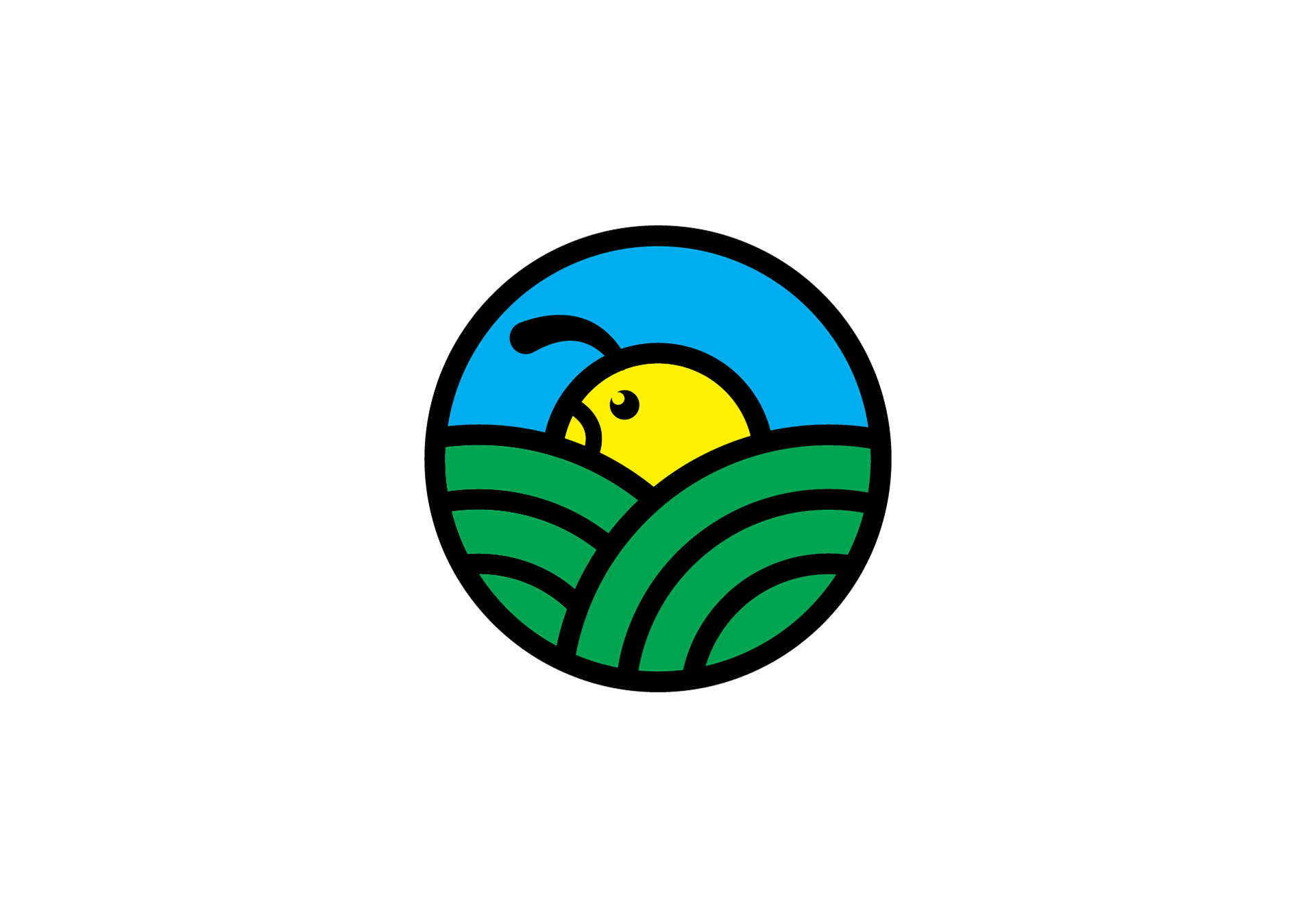
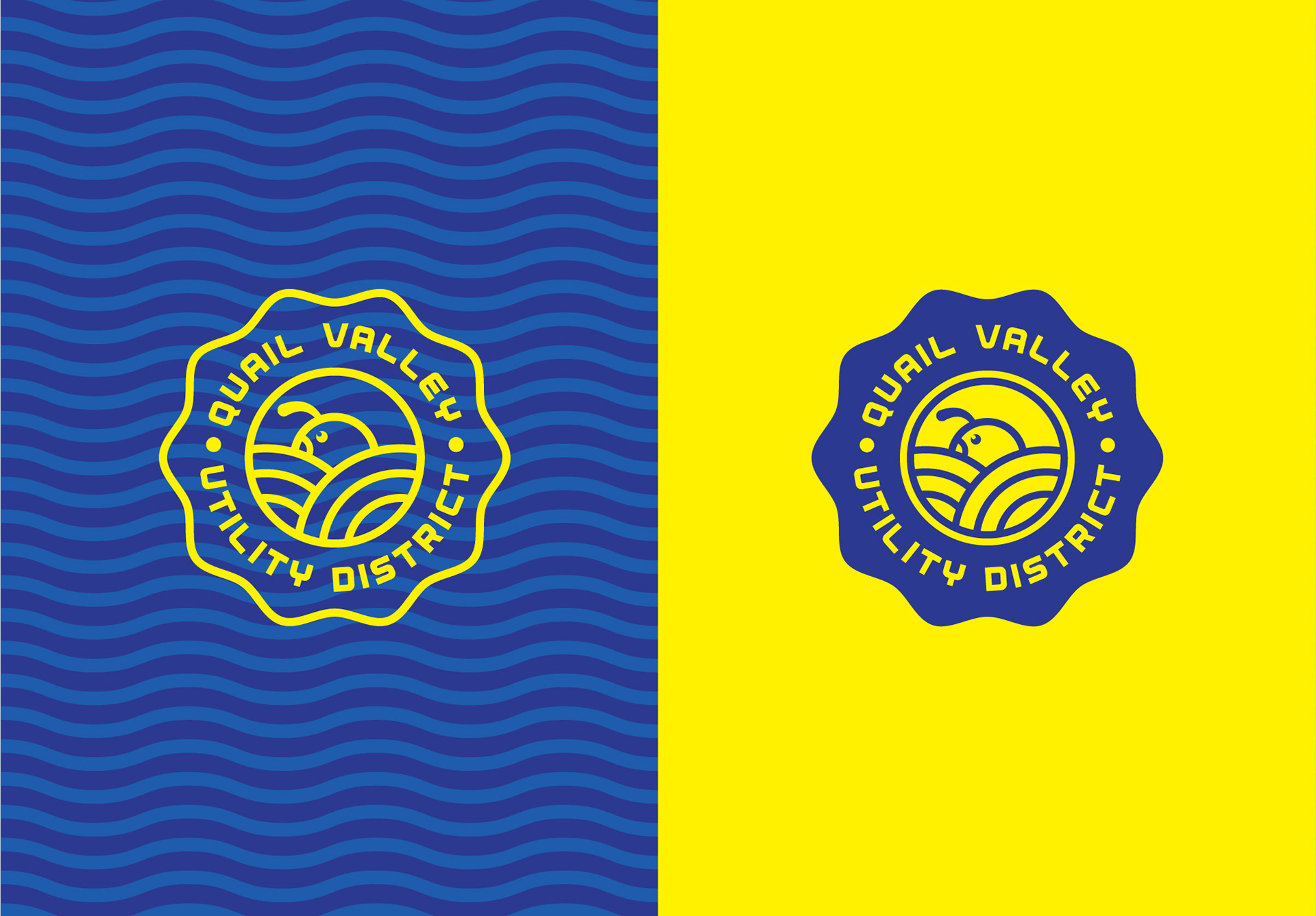
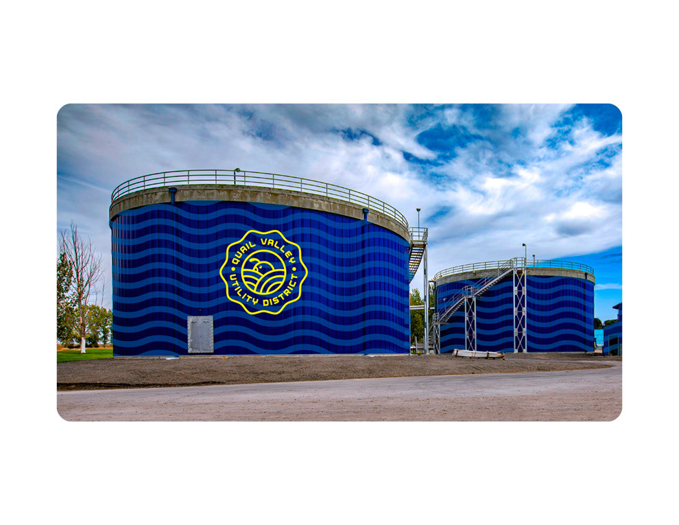
Over the course of a week I put together a few ideas but this one was probably within the first 3 ideas I sketched out. I went for a patch / badge style logo because it was good fit for the apparel I was initially working on and then as a city seal vibe which they could use across multiple media and placements.
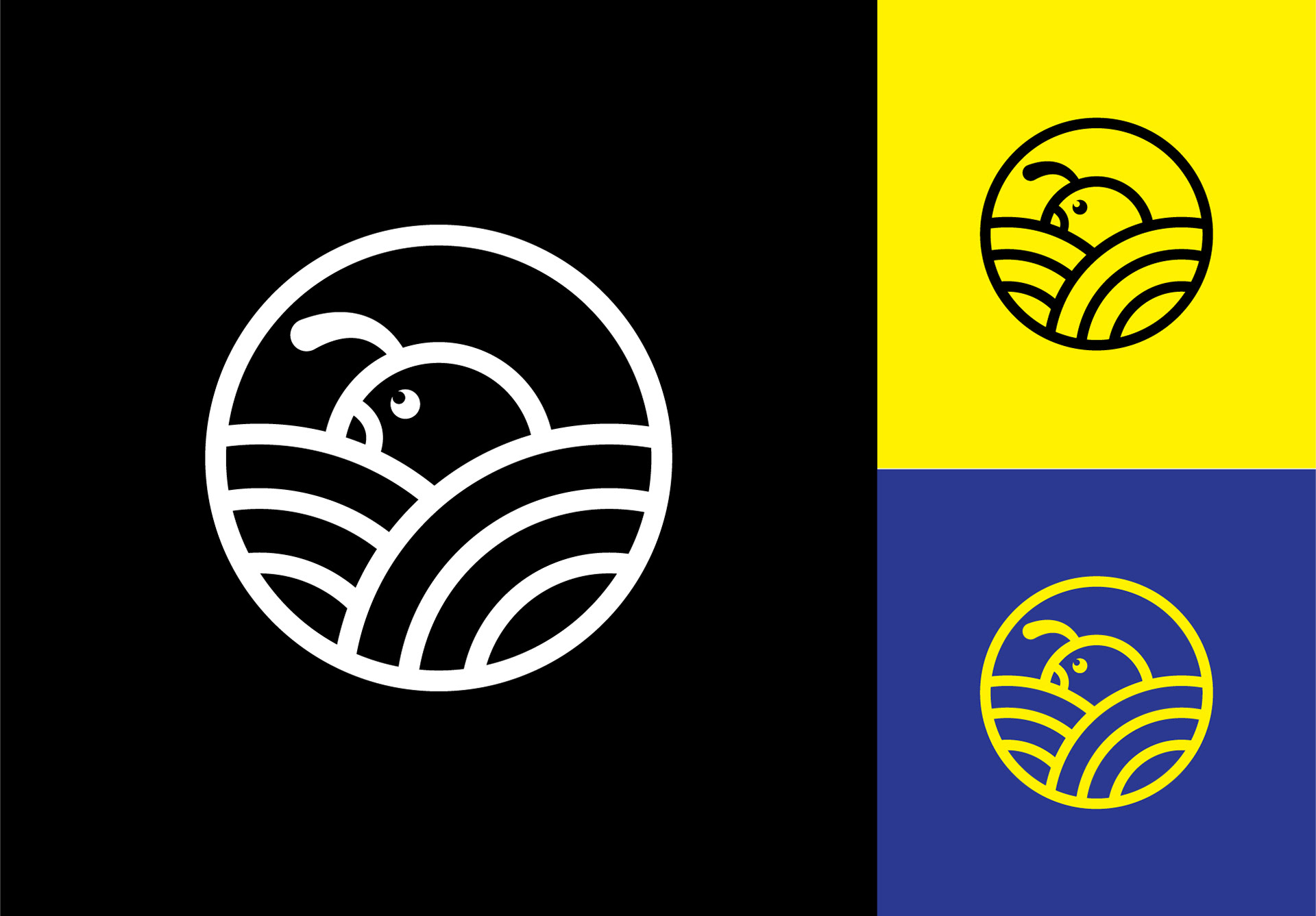
From there I vectorized the sketch with concentric circles, basic color palette and used my font, Aerial, to build out the rest because it was (wait for it) utilitarian, bold and simple. I had a different color palette originally but after showing my in-law, we decided to adjust to the blue since the Quail Valley Utility District is more of a sewage and water department than a parks and rec dept, which is where I initially headed.
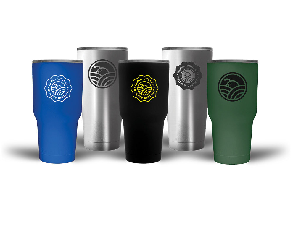
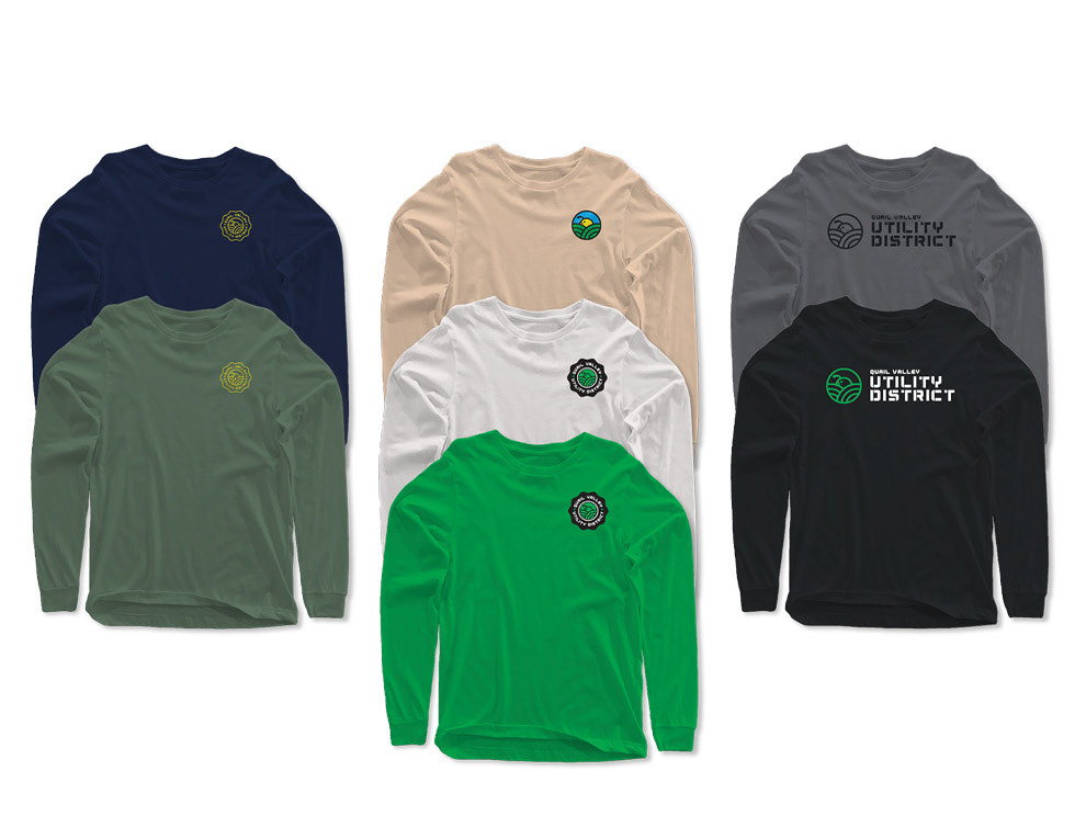
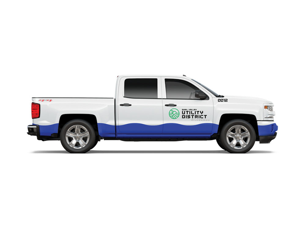
The brand should expand beyond a business card as any good designer would envision, right?
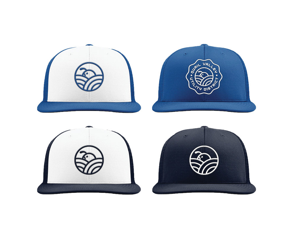
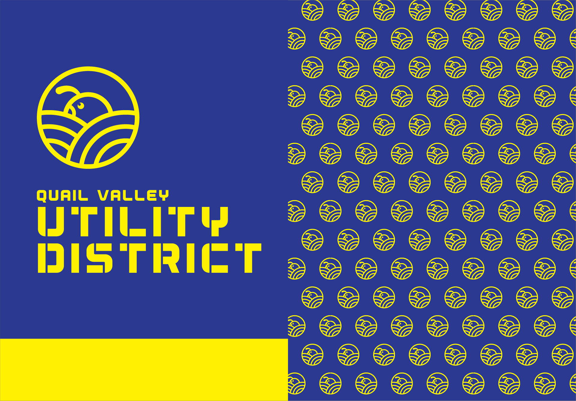
For a shirt and a trucker hat project, it definitely escalated in scale of use.
It needed an update if I was going to work with it.
Over the course of a week I put together a few ideas but this one was probably within the first 3 ideas I sketched out. I went for a patch / badge style logo because it was good fit for the apparel I was initially working on and then as a city seal vibe which they could use across multiple media and placements.
From there I vectorized the sketch with concentric circles, basic color palette and used my font, Aerial, to build out the rest because it was (wait for it) utilitarian, bold and simple. I had a different color palette originally but after showing my in-law, we decided to adjust to the blue since the Quail Valley Utility District is more of a sewage and water department than a parks and rec dept, which is where I initially headed.
The brand should expand beyond a business card as any good designer would envision, right?
For a shirt and a trucker hat project, it definitely escalated in scale of use.
Anyway, hope you enjoy it.
Inspiration came from Peters Design Co.
Font used: Aerial Type Family by yours truly.
Inspiration came from Peters Design Co.
Font used: Aerial Type Family by yours truly.