ABOUT SOUTHERN KINGDOM
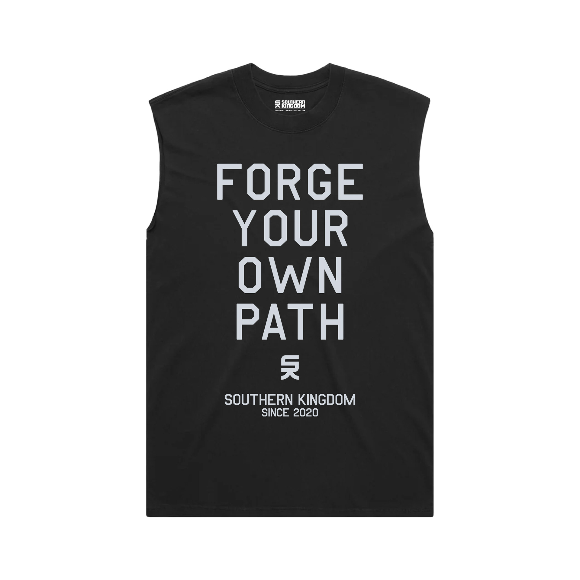
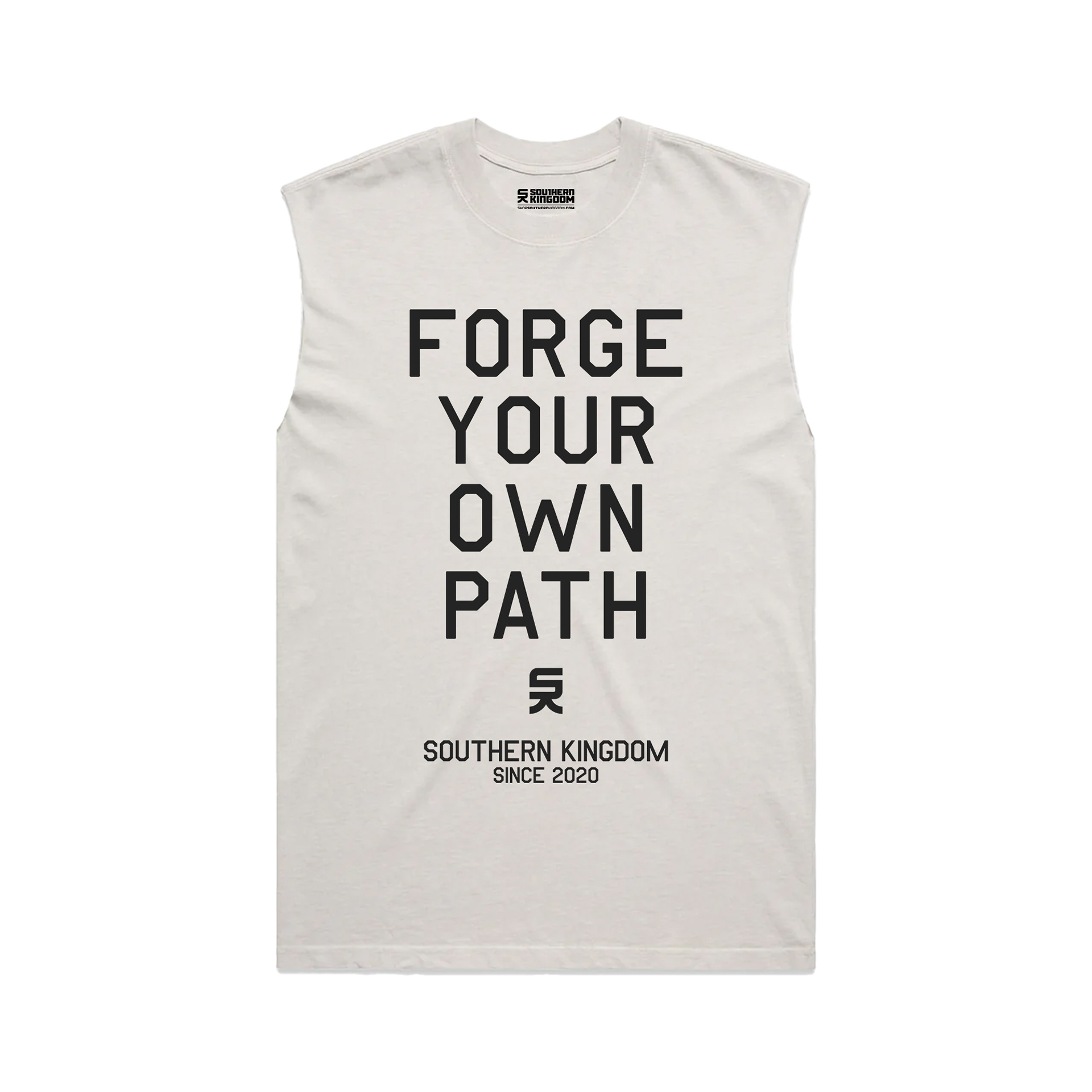
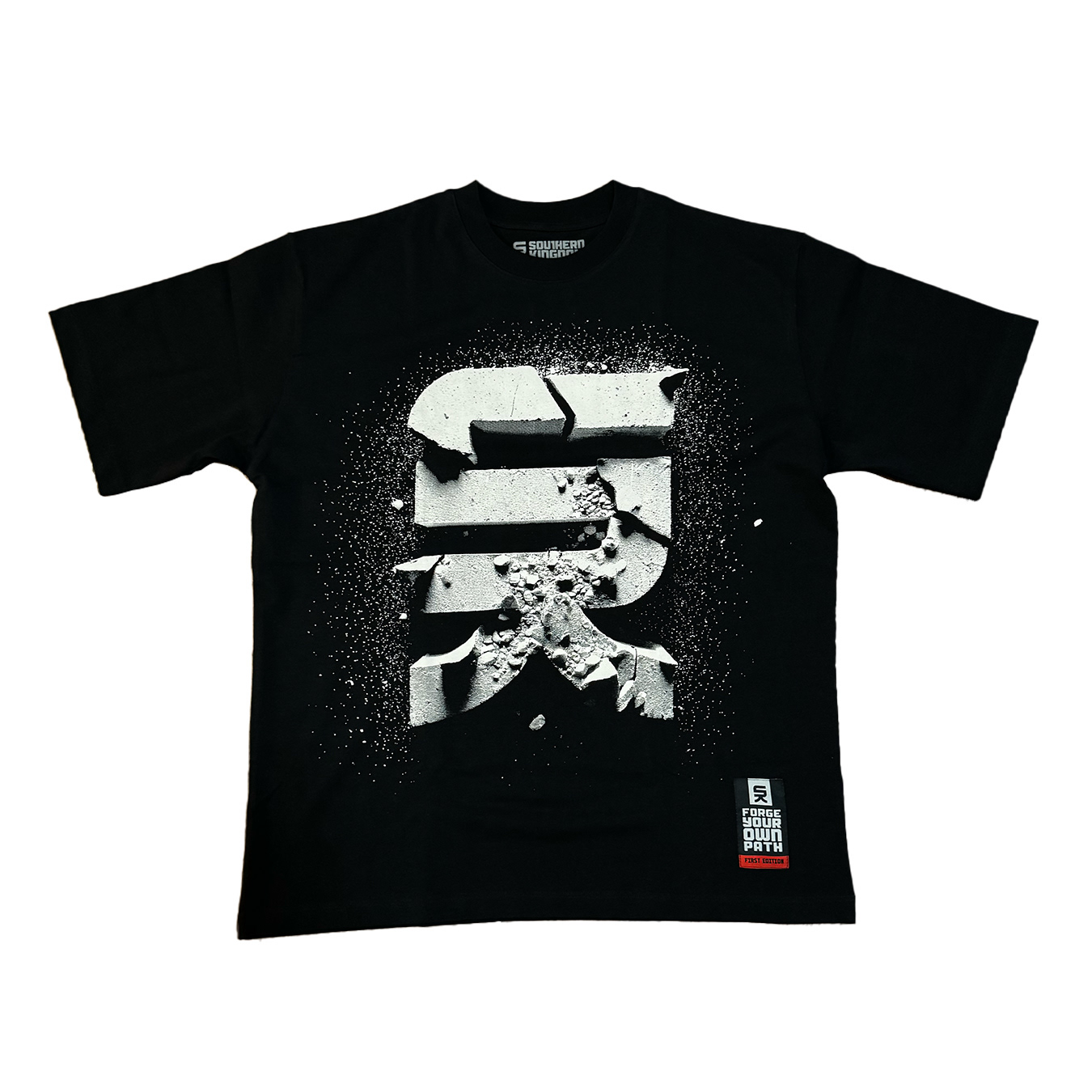
Southern Kingdom is an apparel brand I've been building since around 2019–2020, though the name itself dates back to my early years as a designer. It originally started as a nod to a design agency I admired, and at one point I even considered using Southern Kingdom as the name for my own agency. The name also carries a subtle biblical influence, which helped shape some of the brand's identity.
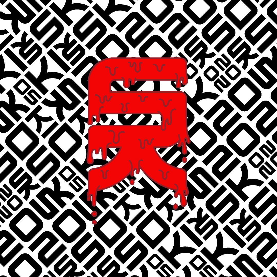
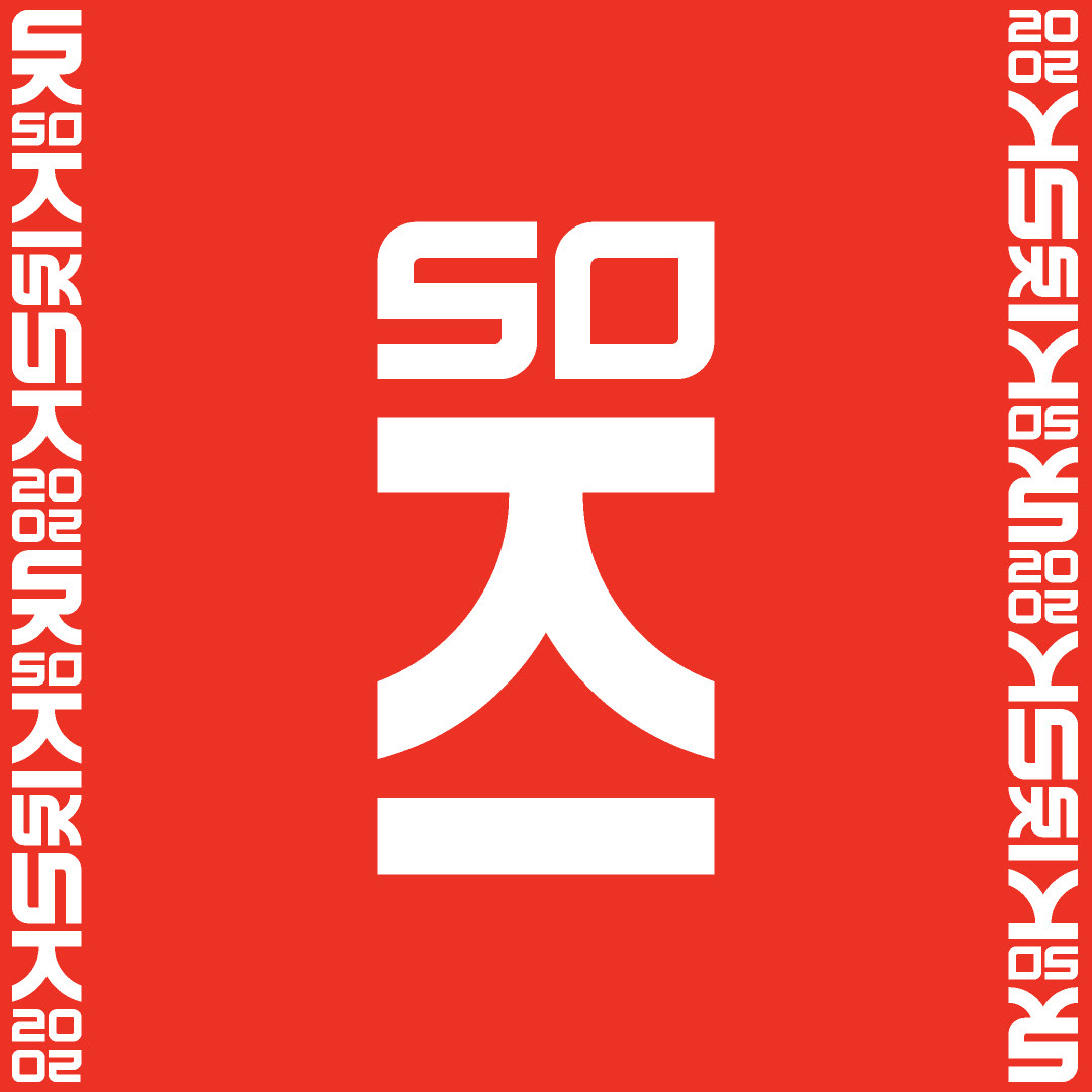
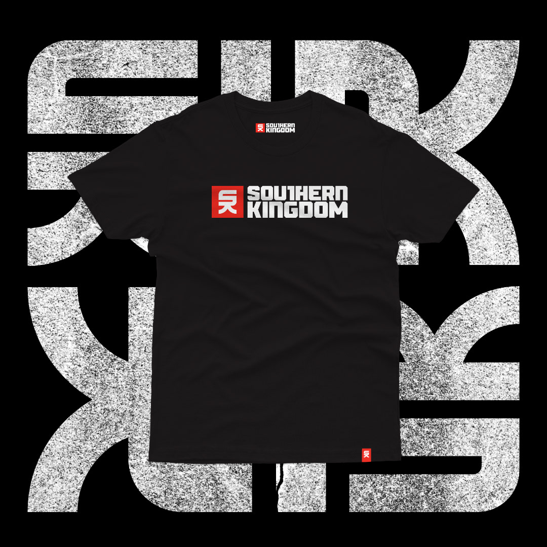
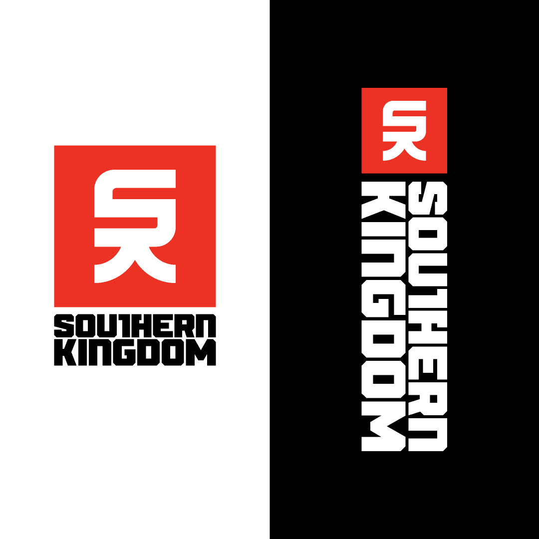
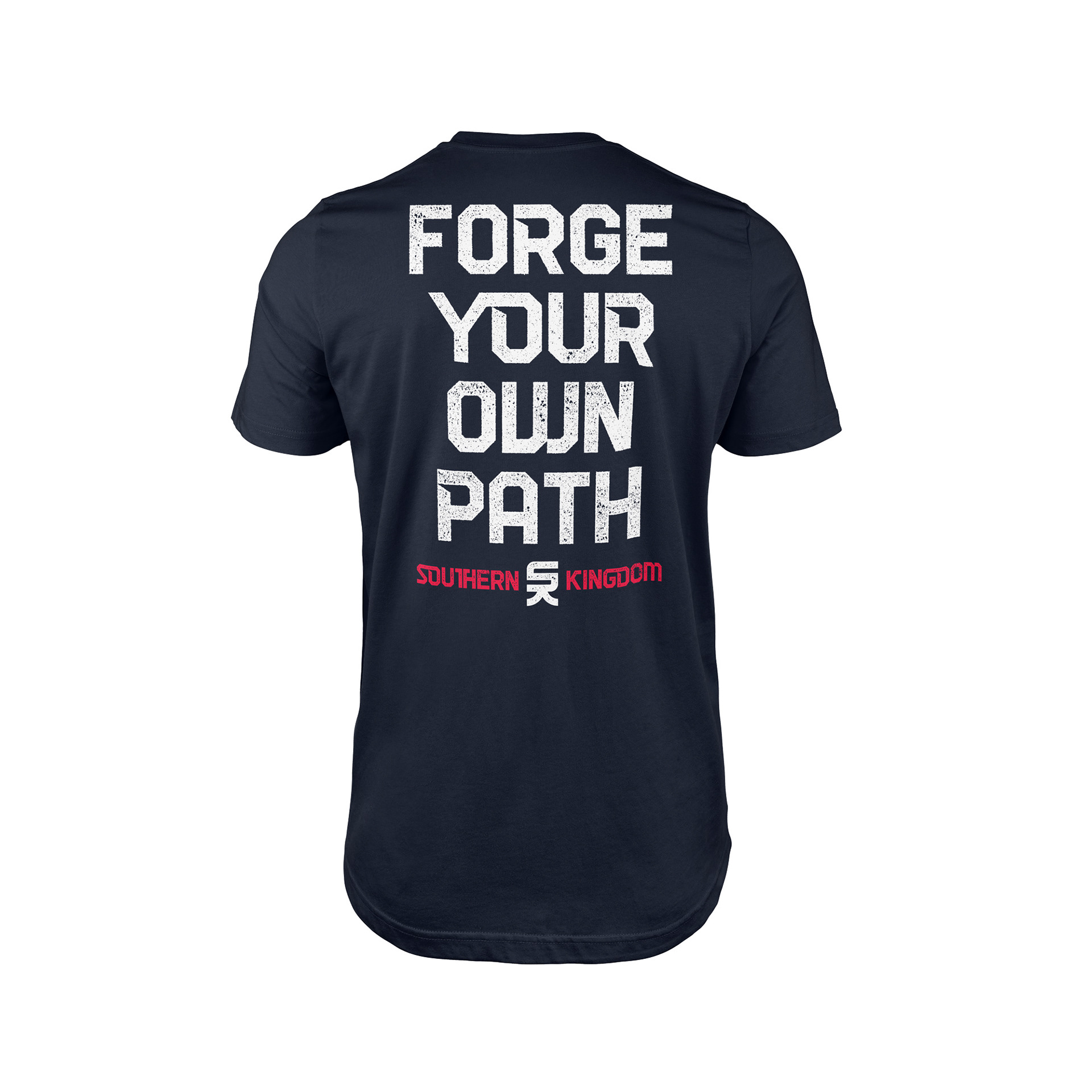
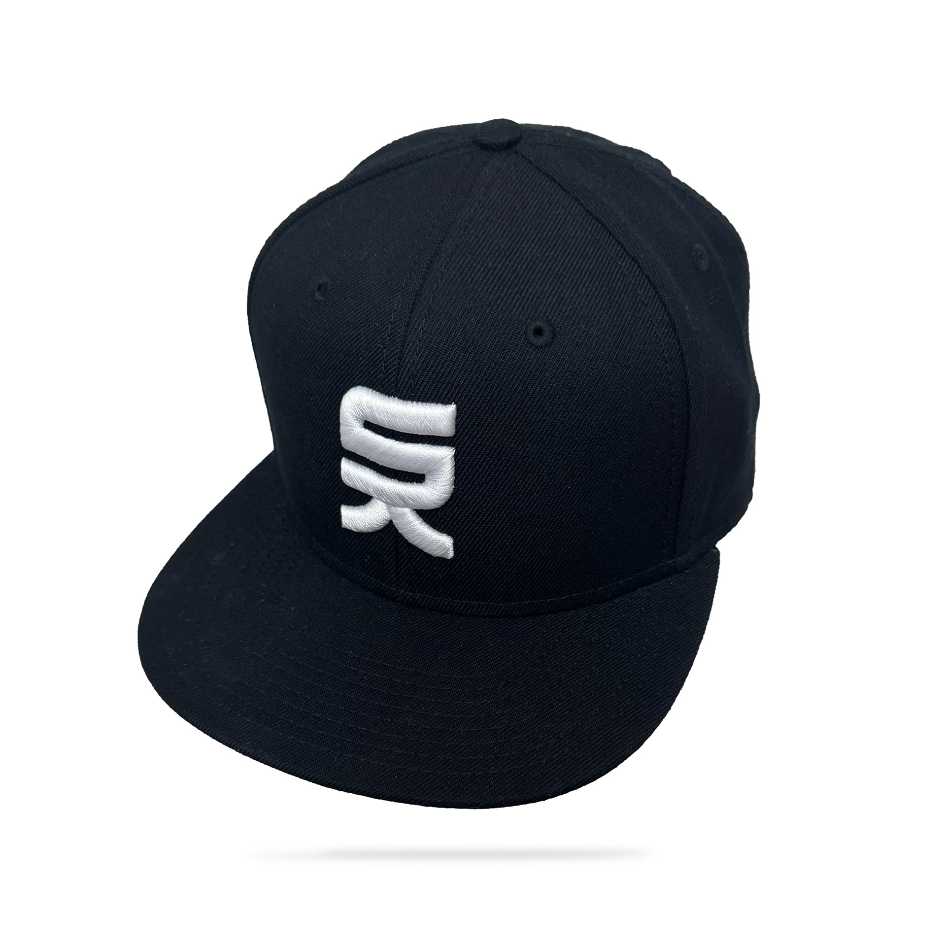
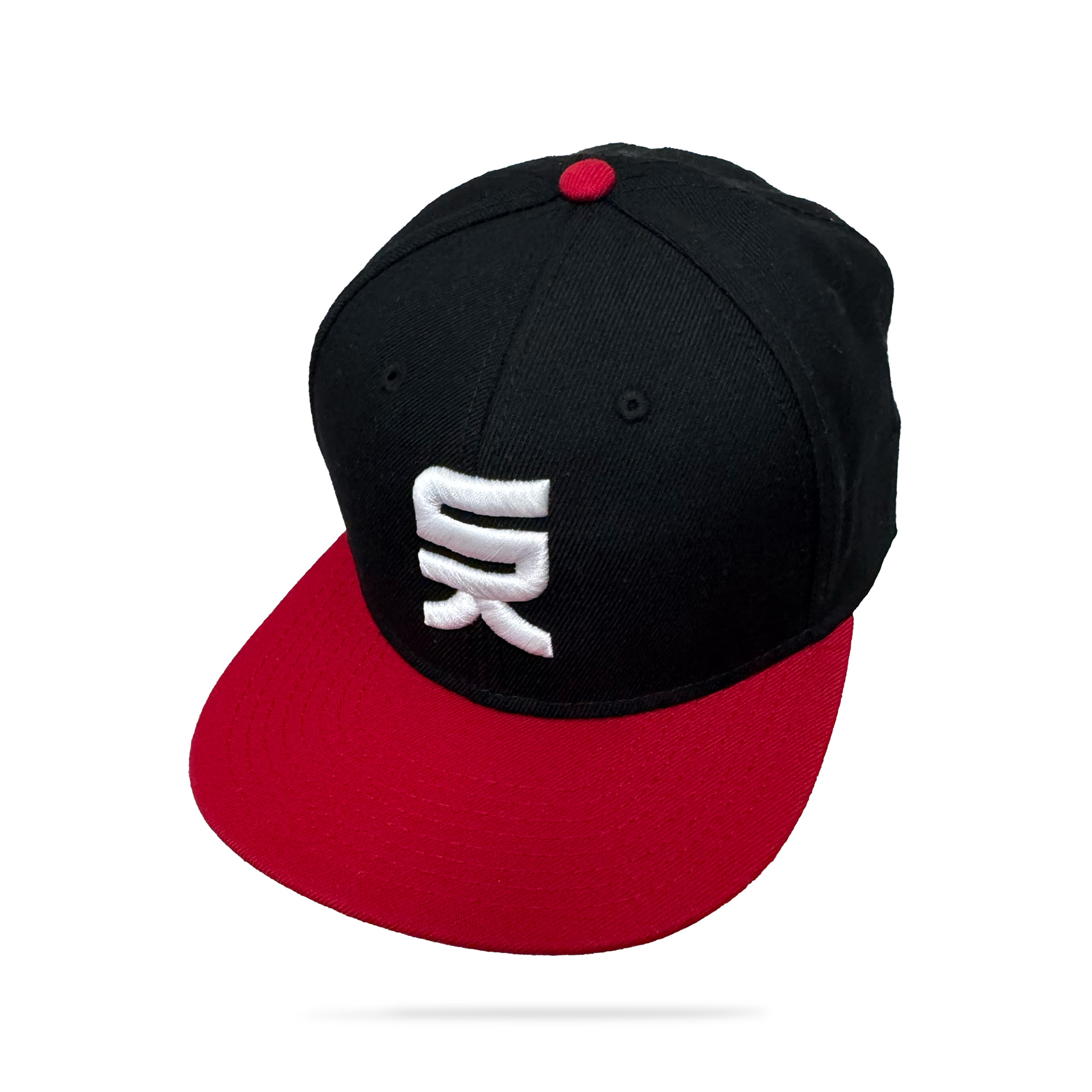
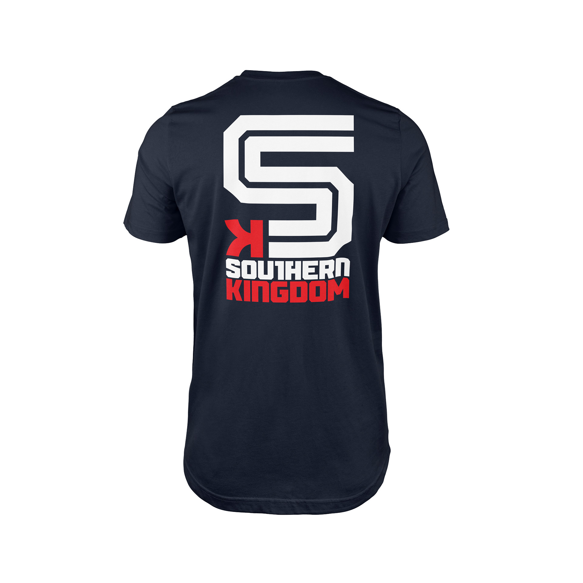
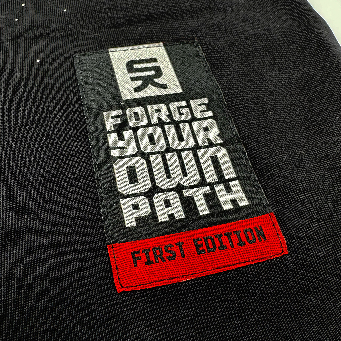
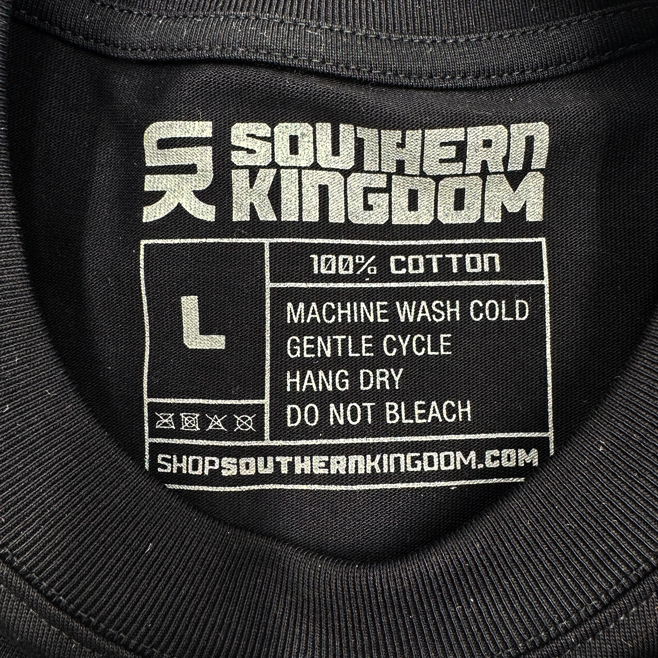
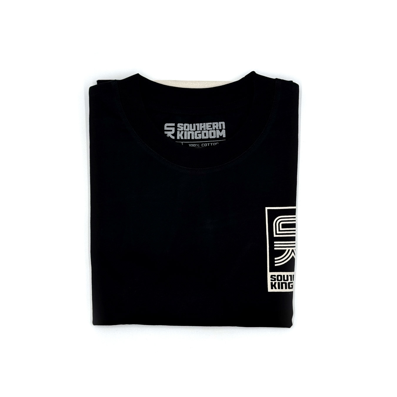
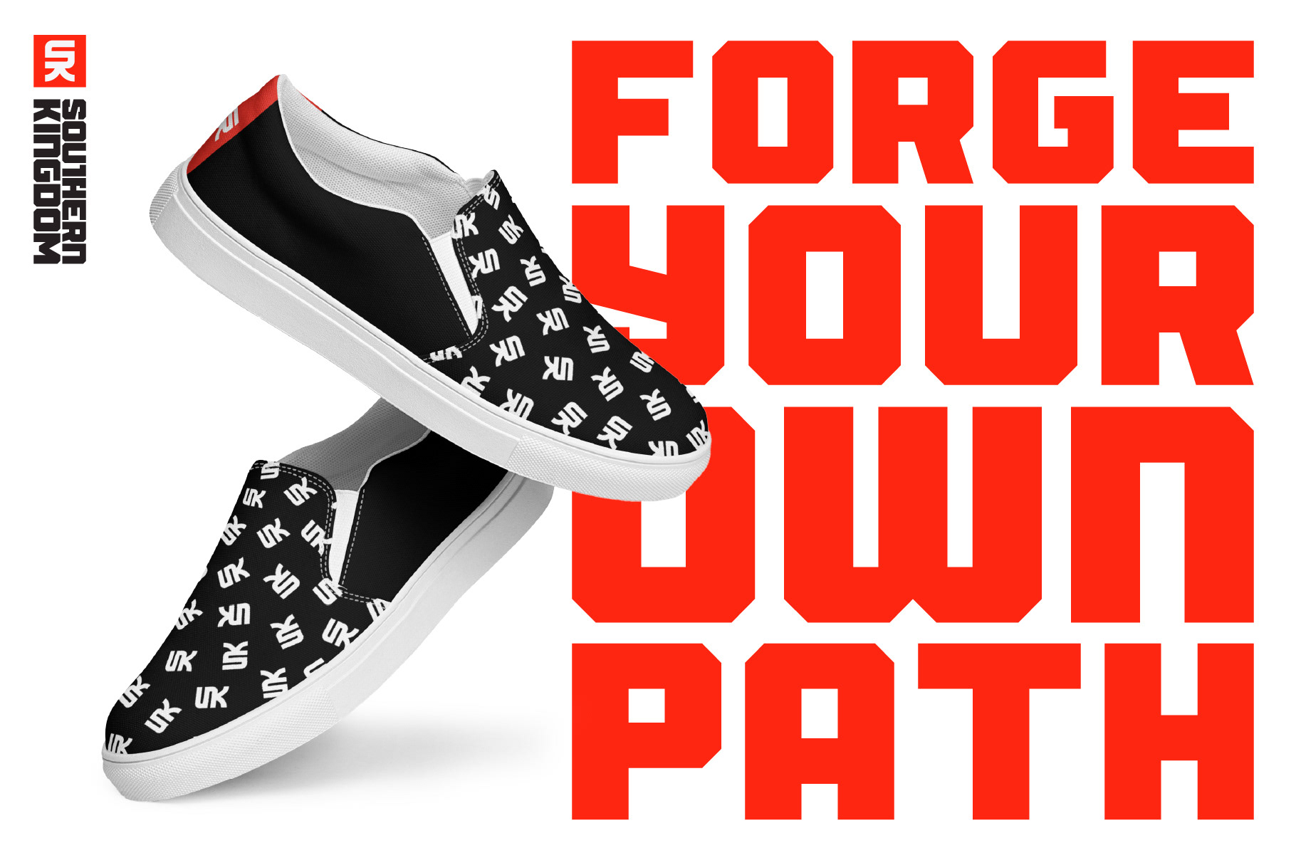
From the beginning, I wanted the brand to feel bold, confident, and typographic. The logo was intentionally built with thick, heavy forms that could stand on their own across apparel and branding applications. The color palette took a little longer to figure out. As someone who naturally gravitates toward blue, I challenged myself to explore something different, ultimately landing on a red, black, and white system that felt stronger and more distinctive for the brand.
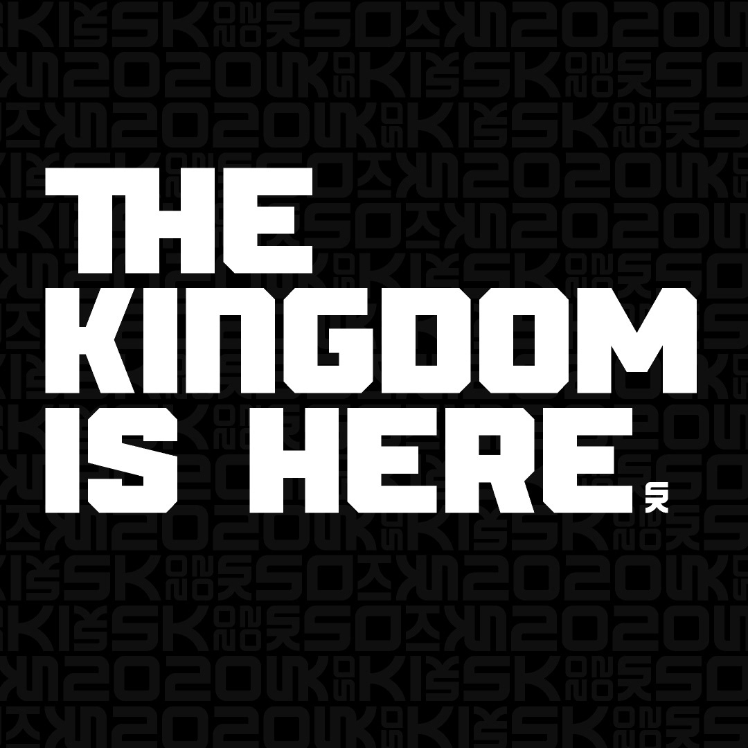
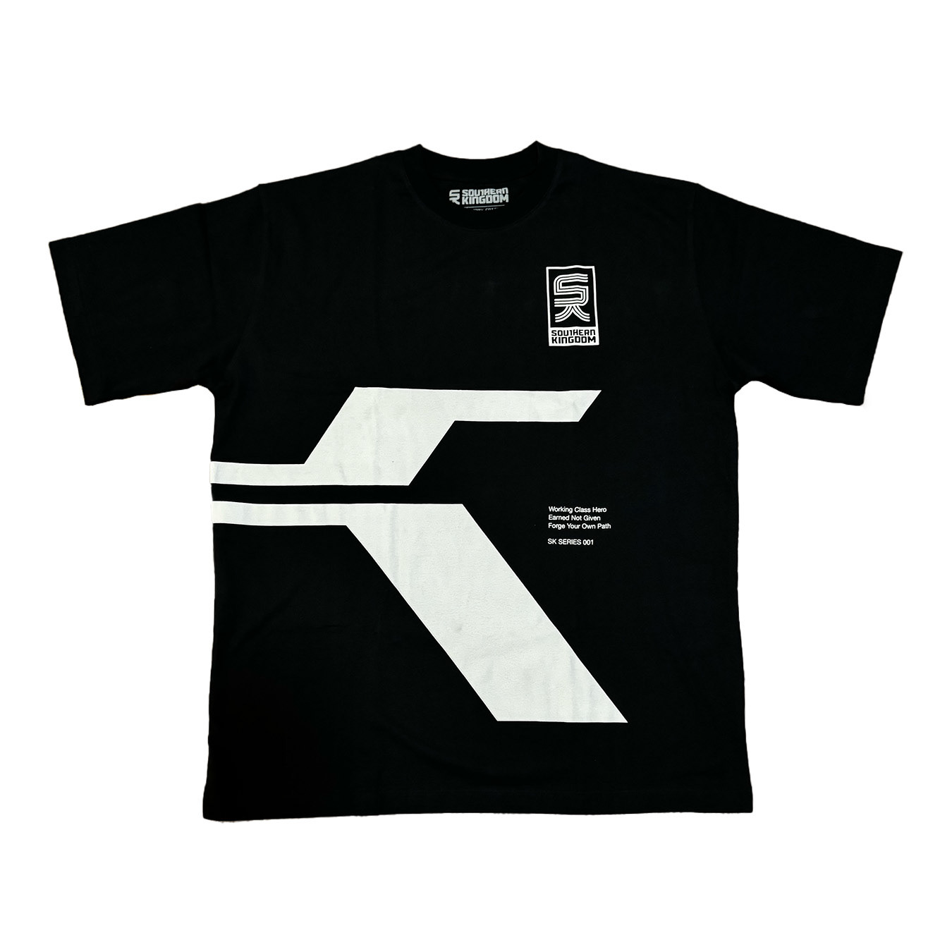
Like most long-term creative endeavors, Southern Kingdom has evolved alongside me. The overall aesthetic has shifted over the years, but one constant has been my use of Spartan as the primary typeface. More recently, I've started exploring additional typefaces and design directions, treating Southern Kingdom as its own brand rather than an extension of my personal work.
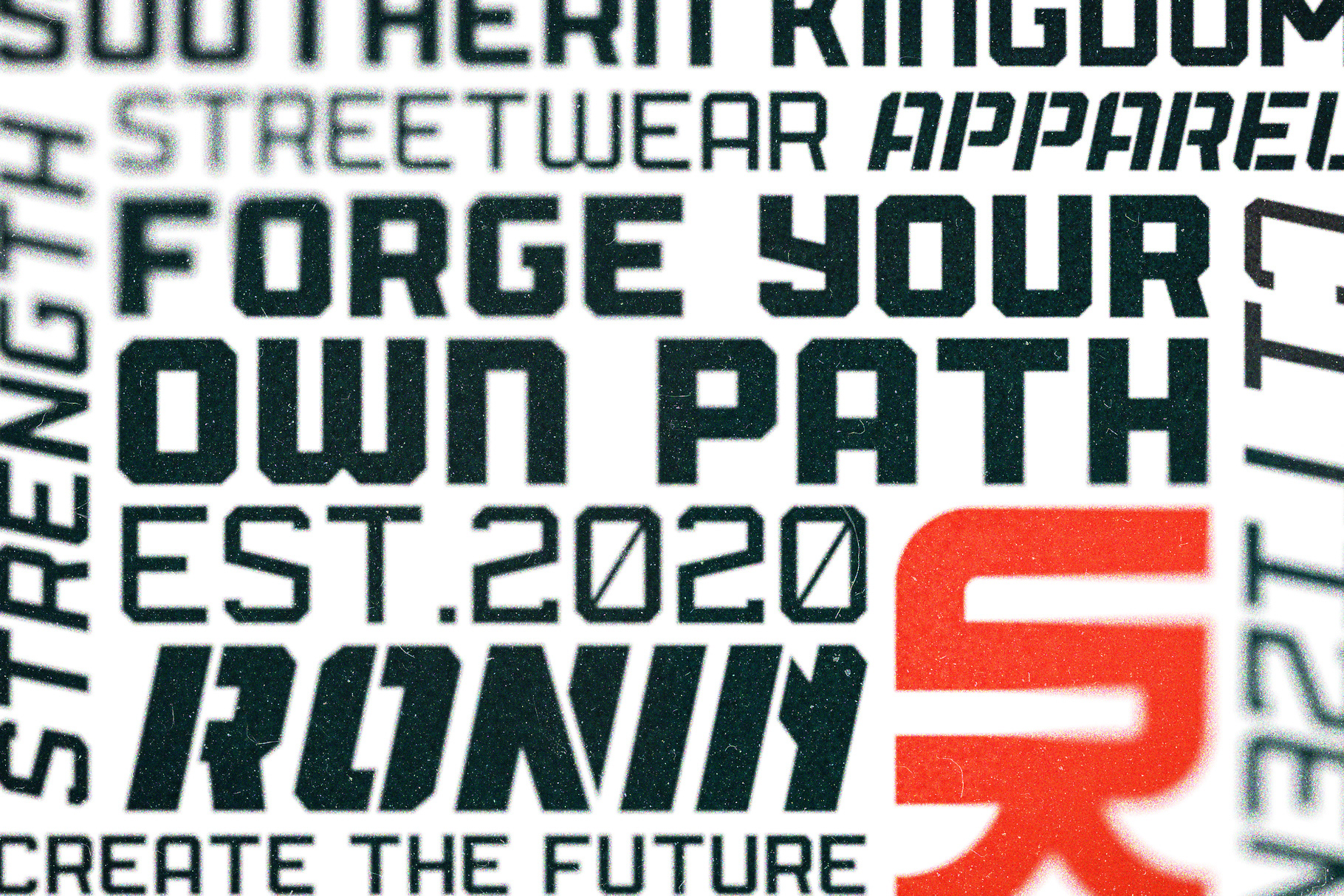
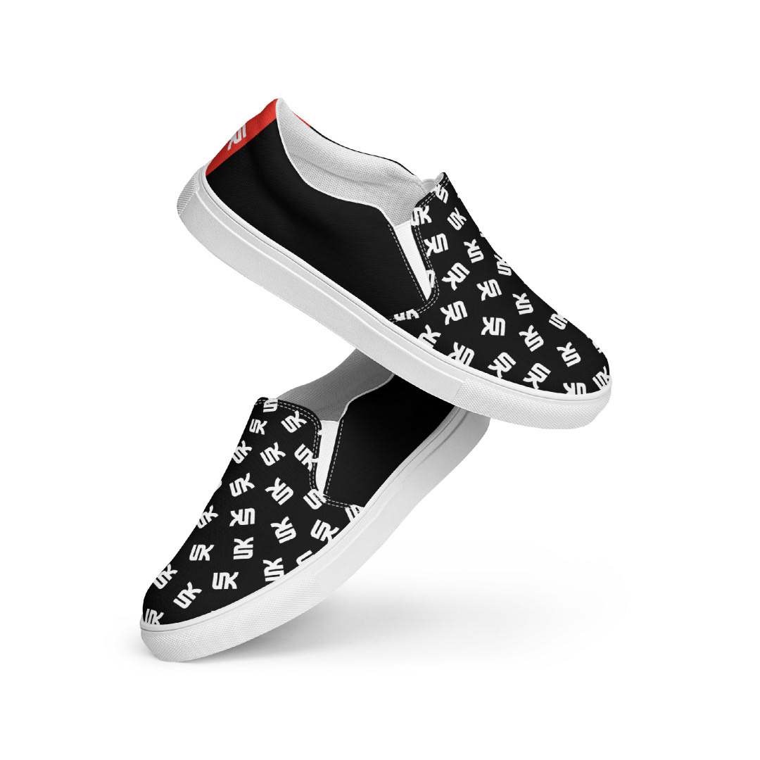
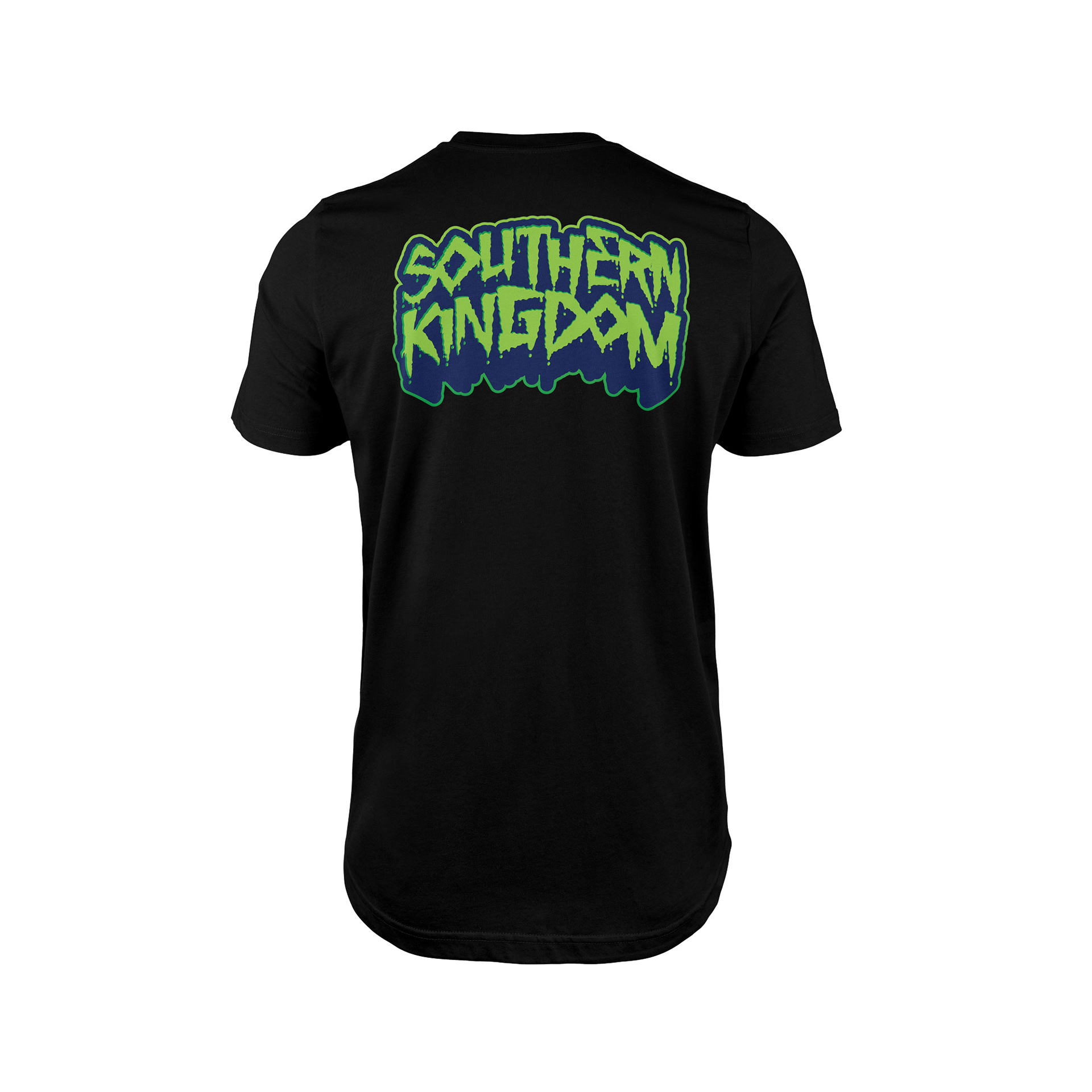
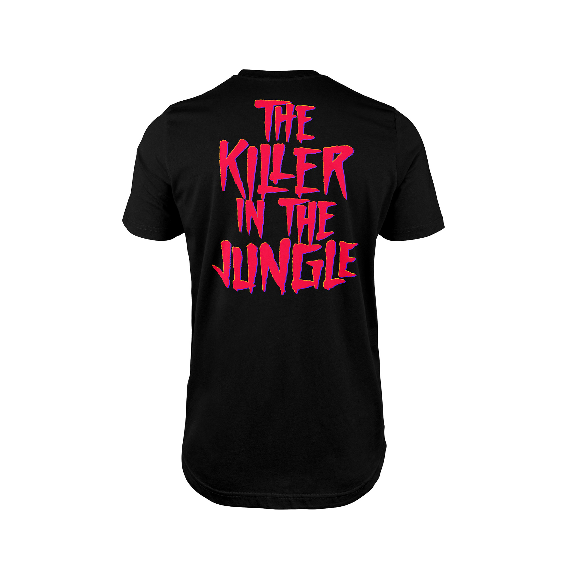
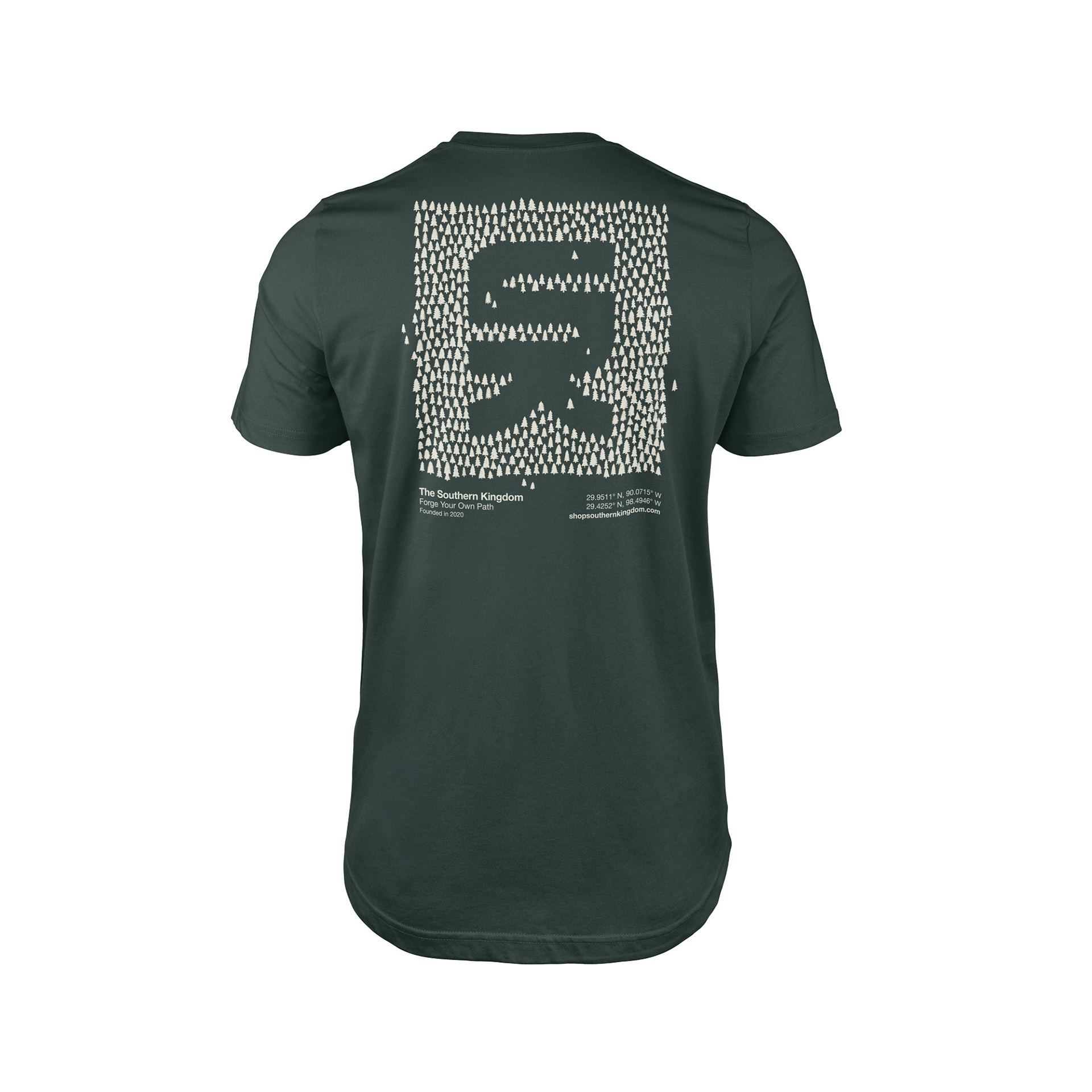
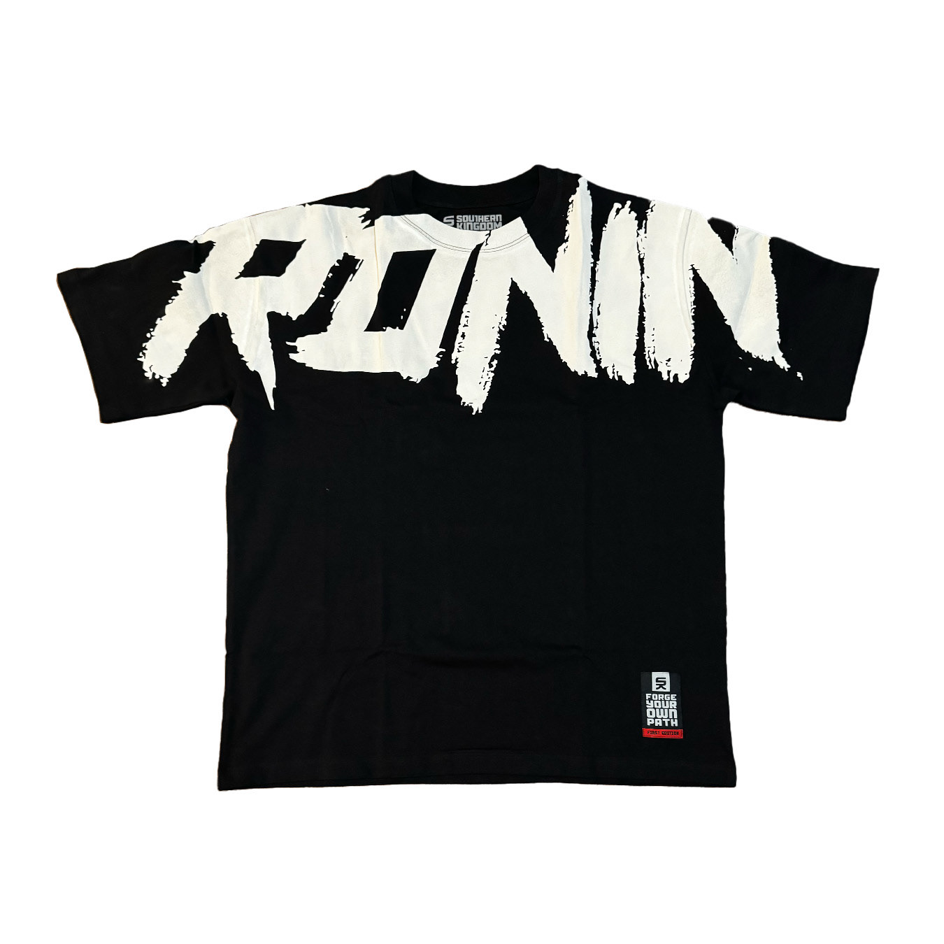
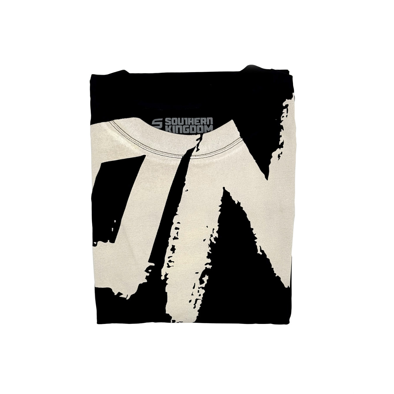
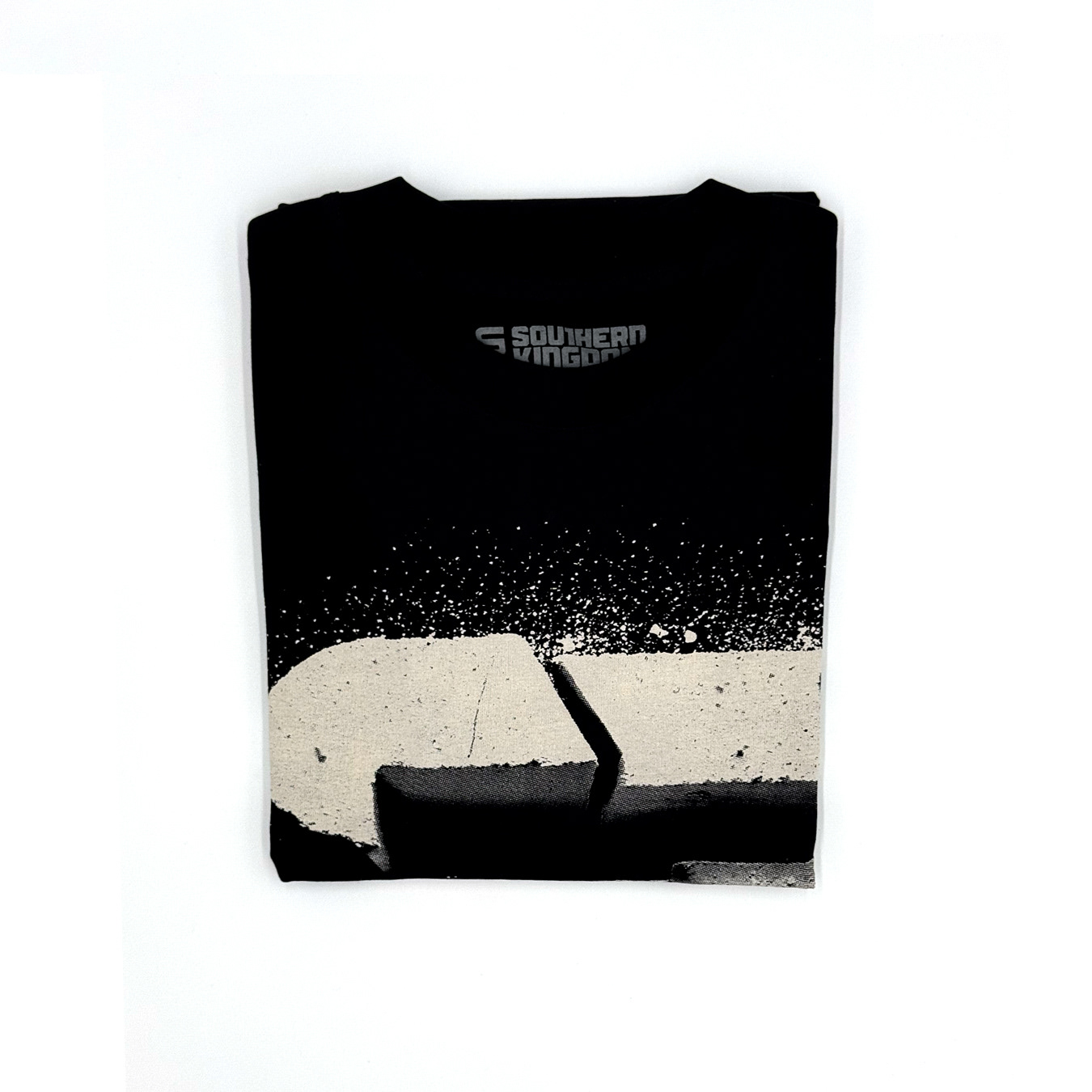
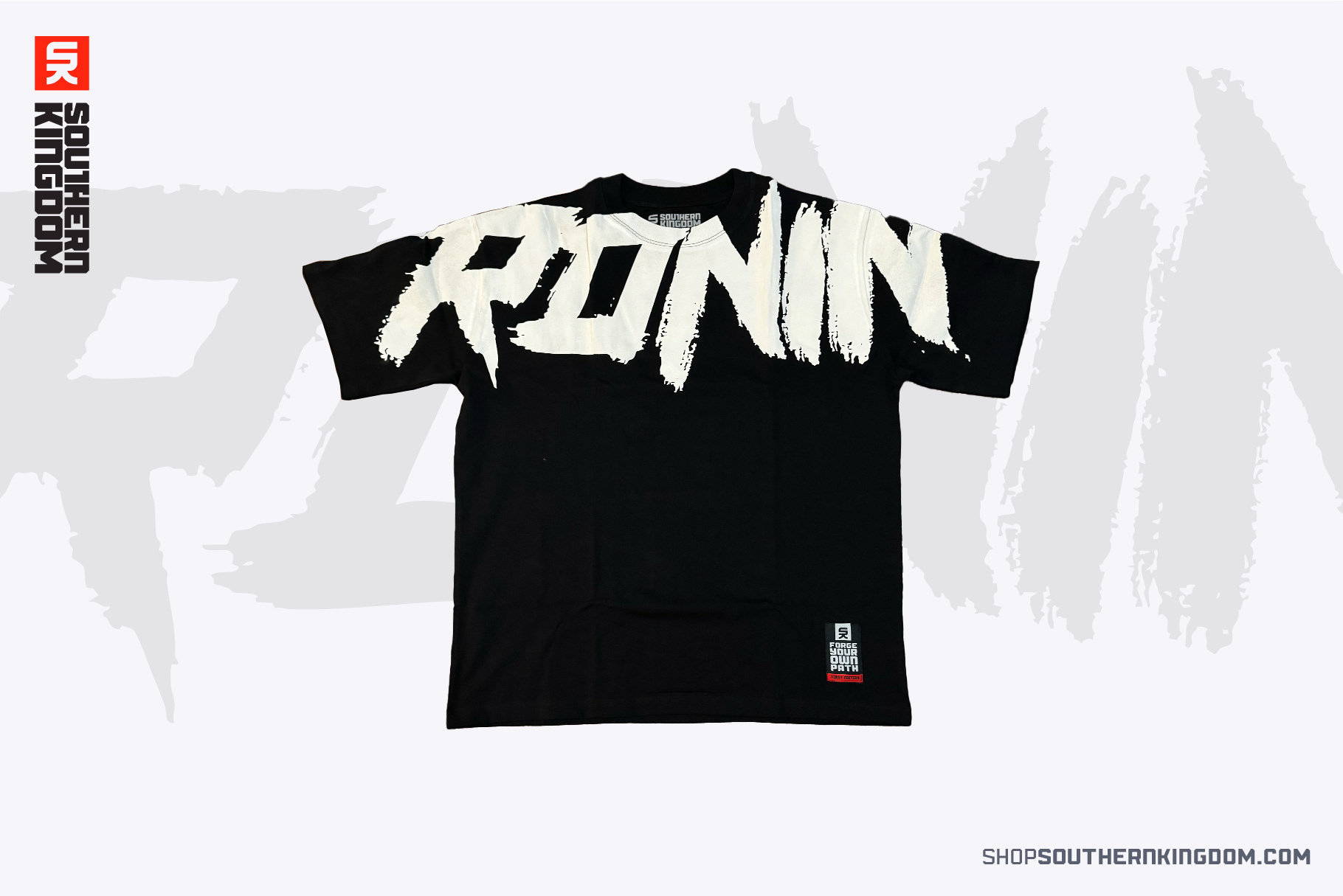
What began as an apparel brand has gradually become something more. As I've continued developing typefaces and lettering, I've used Southern Kingdom as a platform to showcase my own fonts and custom typography in a real-world setting. Rather than creating type in isolation, the brand gives me a place to put those ideas into practice through apparel, graphics, and storytelling.
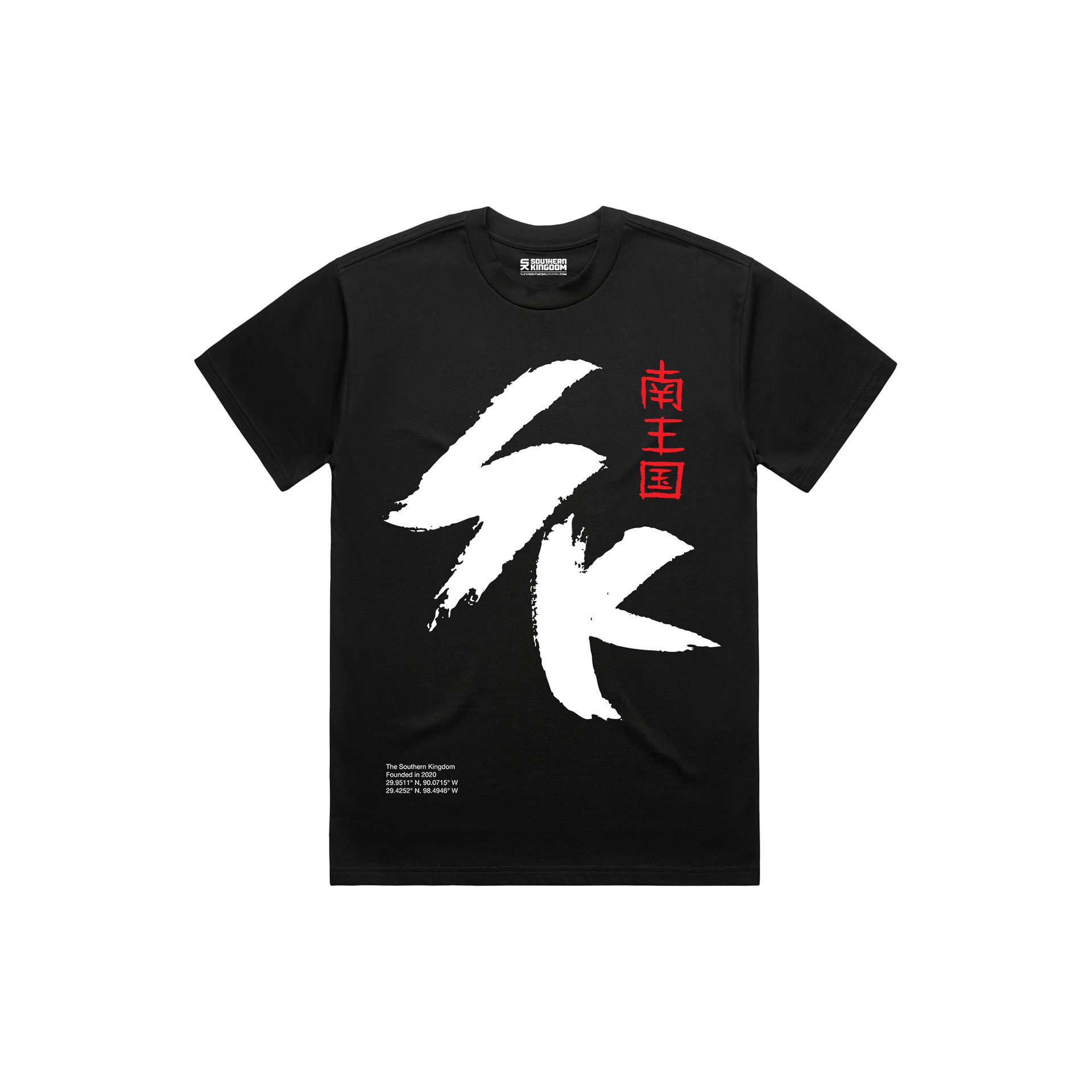
Behind the visuals is a larger narrative still taking shape. Drawing inspiration from everything from LOTR to feudal Japan, Southern Kingdom is slowly evolving into its own world. It's still very much a work in progress, but that ongoing sense of discovery is part of what keeps the brand moving forward.