
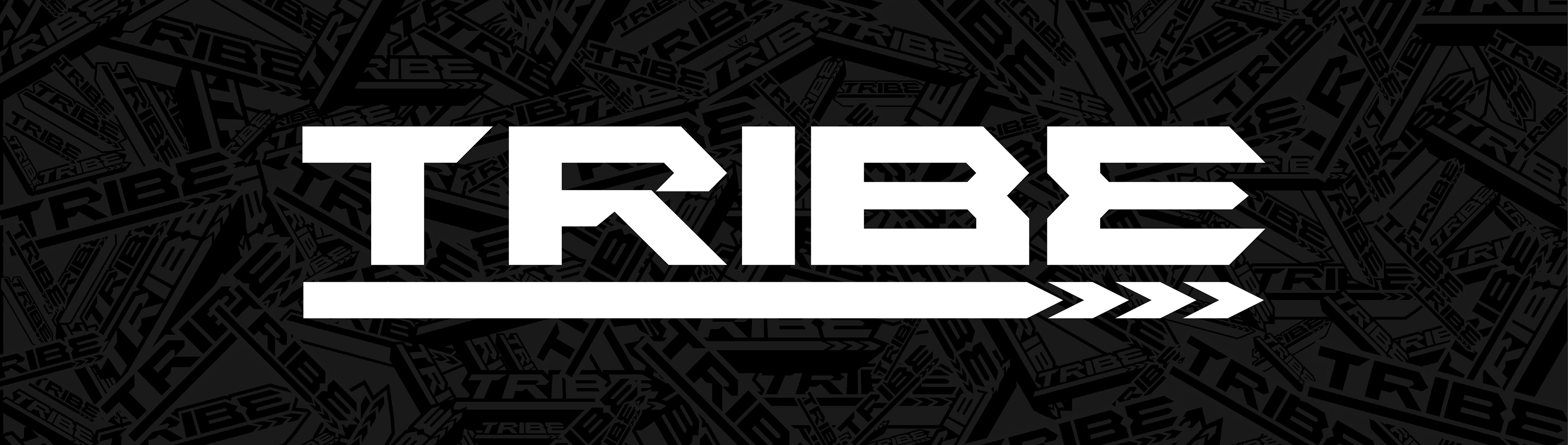
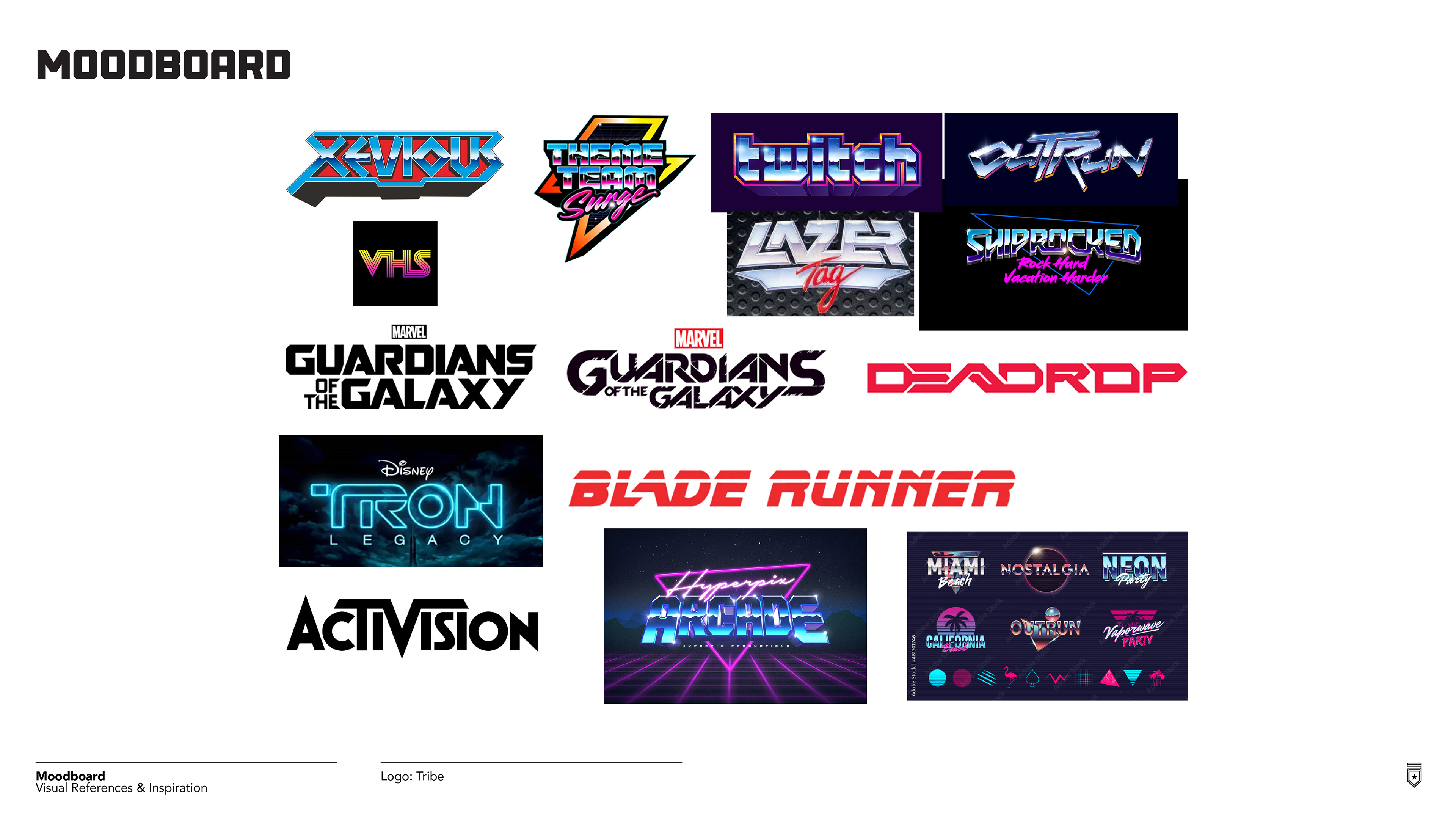
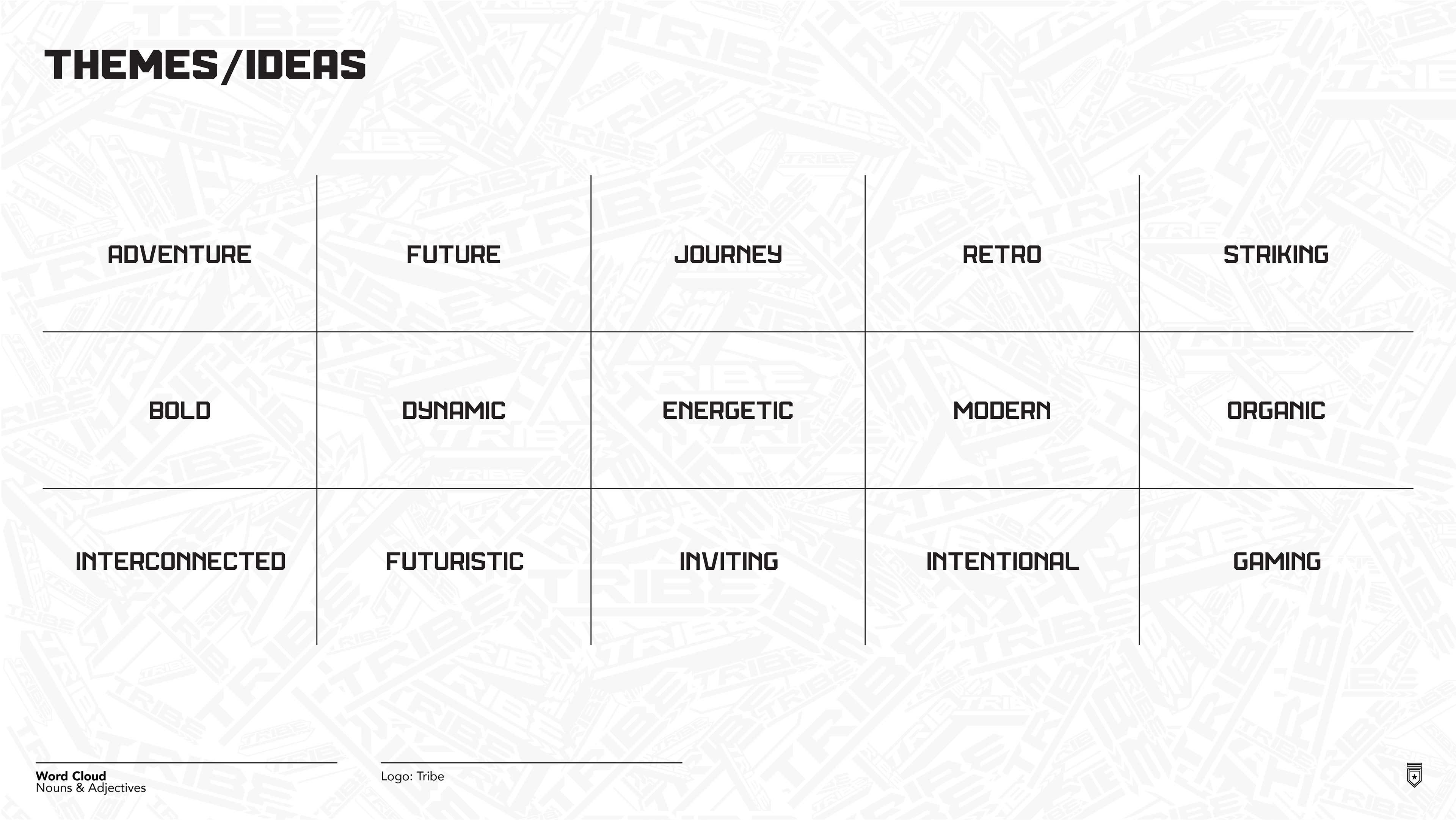
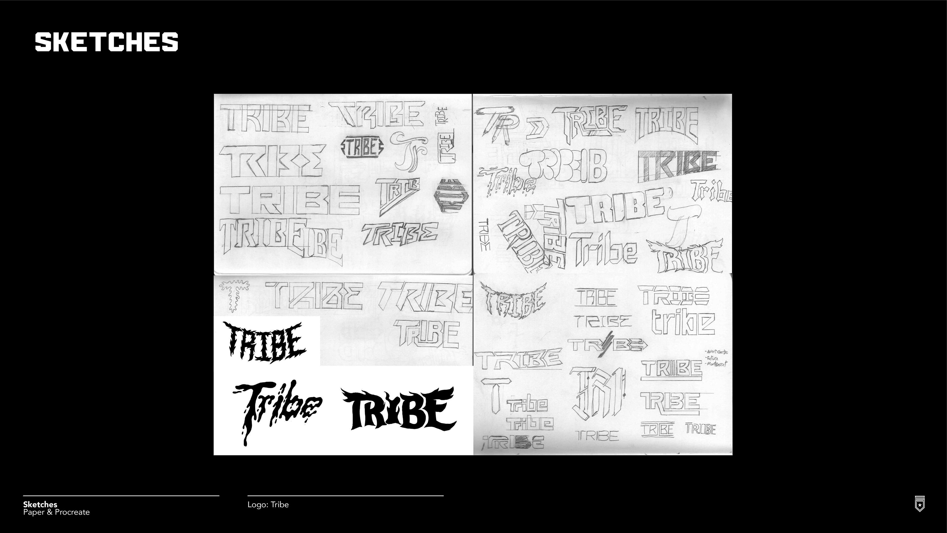
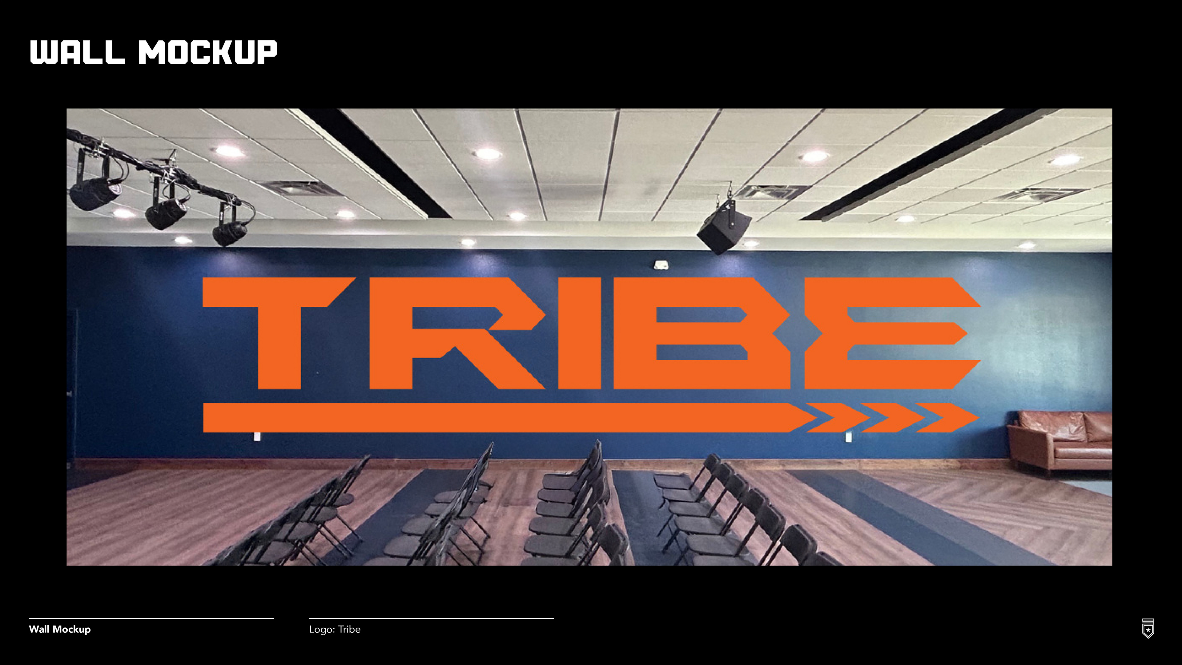
In late 2025, I was approached by a repeat client of mine to create a logotype for their church youth group's Wednesday night service called "Tribe." The main purpose of the logo aside from the obvious branding was to fit within a large, wide wall space and be a statement piece. It's a simple project that I gave tons of effort and style into as I really pushed myself to explore new ideas. The initial call with both clients was fun and very useful as it helped lay the foundation for the direction on the moodboard and then into our Noun/Adjective List. After these ideas and styles were mutually agreed upon, I pushed into the sketch phase and started throwing some ideas into vector to see how things were starting to pan out.
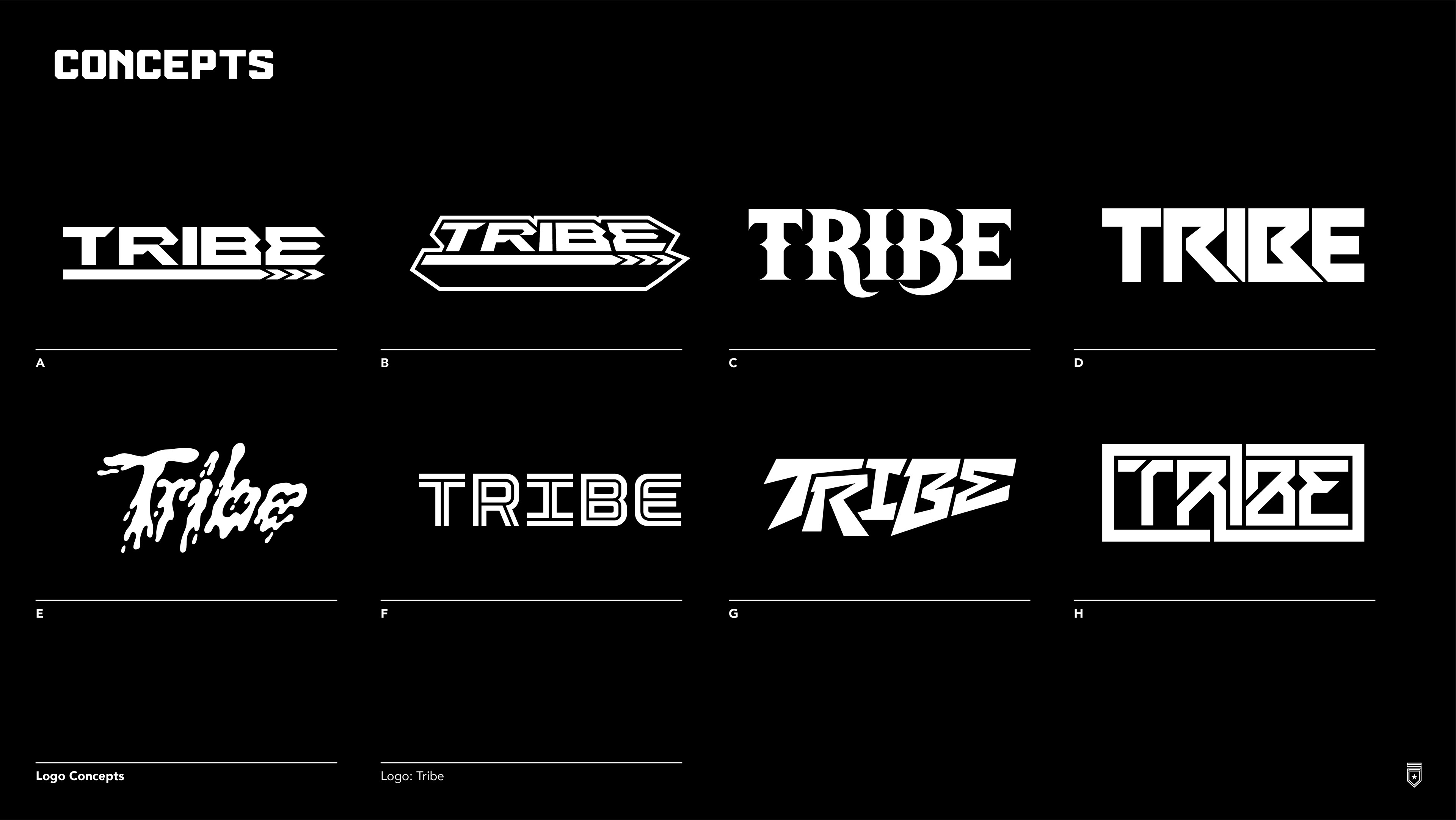
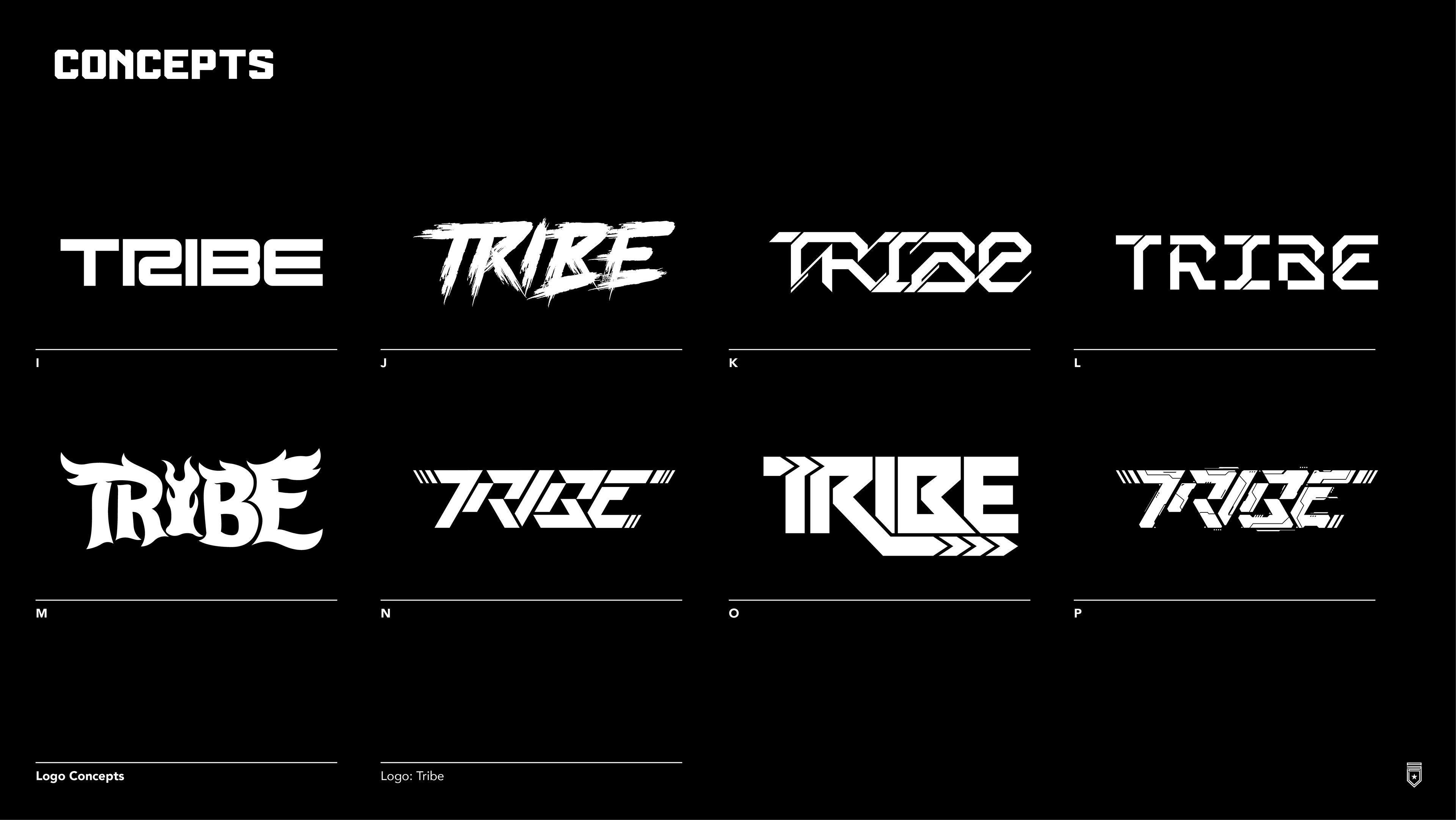
The ideas kept flowing but I eventually settled on enough ideas that I could get a gauge as to where the client was wanting to go. Round 1's feedback provided more direction by adding directional Arrows somewhere and refinement into a few of the initial ideas but kept some "as is." They loved a lot of what I presented, so I had to give them time to narrow down their top ideas. Eventually, they landed on a simple type style (to my surprise) yet liked an added 3D-ish take I did with it, so we proceeded with the 2 concepts as a primary/secondary pairing.
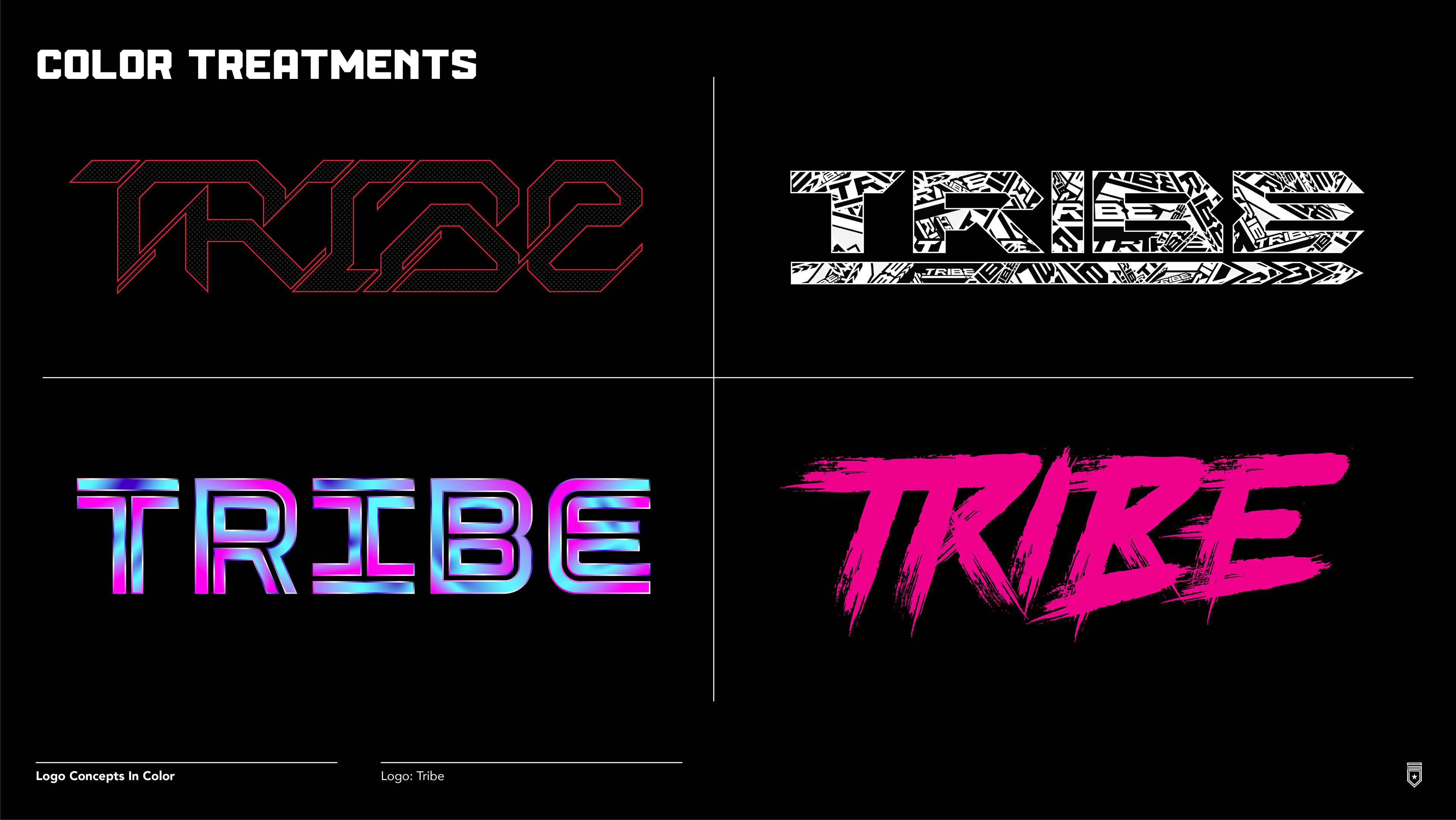
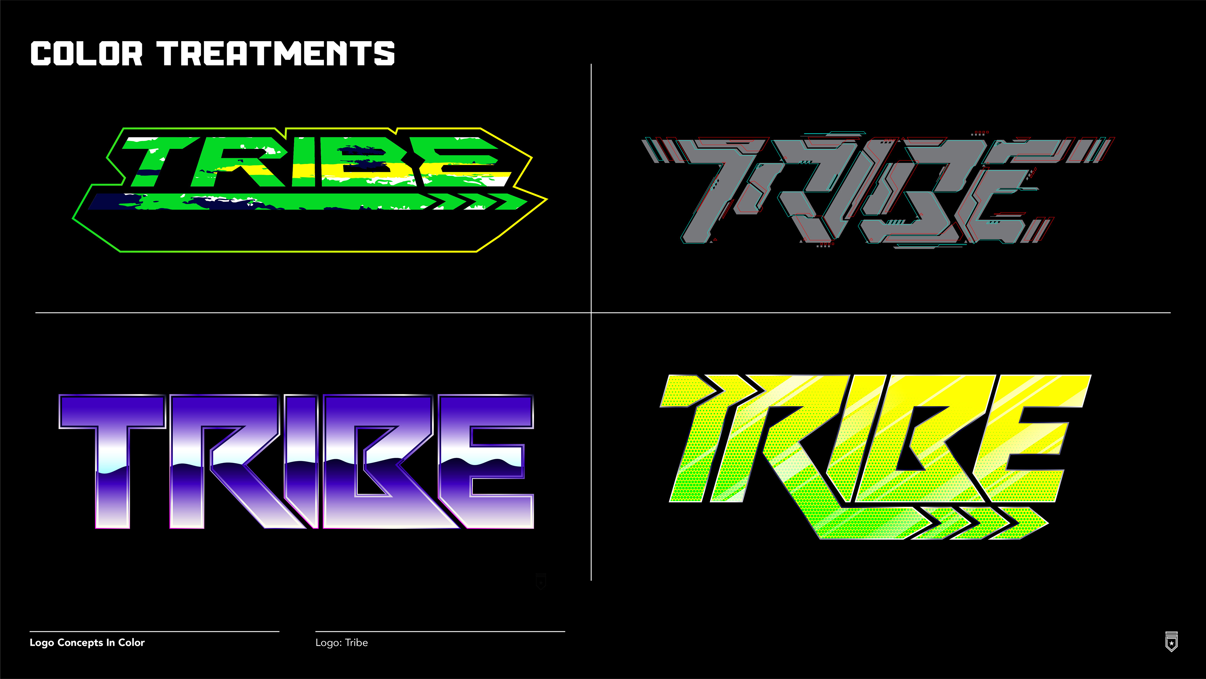
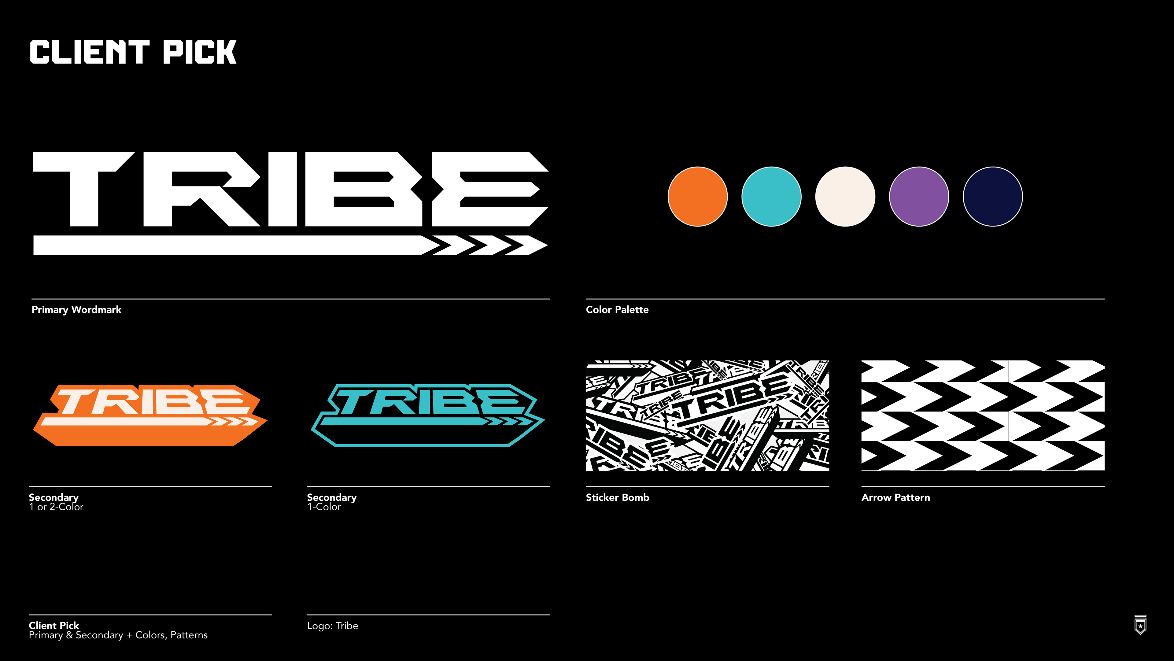
Next, we went into the color exploration kind of open-minded and experimented with some energetic and loud palettes. We knew we wanted the Navy/Orange to be core colors since they'd nod to other logo projects I'd completed a few years prior and help build some brand consistency within the church's brand ecosystem. Ultimately, they landed on a Retro-Future palette. The whole idea of Retro-Future really resonated in terms of striking that balance between the two extremes of being too loud/bright vs quiet/muted. I threw in a logo "sticker bomb" graphic and a few patterns utilizing the directional arrows as a surprise with the standard brand guide work I make for clients. I didn't go too deep on it though, because I wanted to let the youth volunteers help create the brand themselves, give them ownership into how they presented their "Tribe" to others vs me dictating it as an outsider.
The ideas kept flowing but I eventually settled on enough ideas that I could get a gauge as to where the client was wanting to go. Round 1's feedback provided more direction by adding directional Arrows somewhere and refinement into a few of the initial ideas but kept some "as is." They loved a lot of what I presented, so I had to give them time to narrow down their top ideas. Eventually, they landed on a simple type style (to my surprise) yet liked an added 3D-ish take I did with it, so we proceeded with the 2 concepts as a primary/secondary pairing.
Next, we went into the color exploration kind of open-minded and experimented with some energetic and loud palettes. We knew we wanted the Navy/Orange to be core colors since they'd nod to other logo projects I'd completed a few years prior and help build some brand consistency within the church's brand ecosystem. Ultimately, they landed on a Retro-Future palette. The whole idea of Retro-Future really resonated in terms of striking that balance between the two extremes of being too loud/bright vs quiet/muted. I threw in a logo "sticker bomb" graphic and a few patterns utilizing the directional arrows as a surprise with the standard brand guide work I make for clients. I didn't go too deep on it though, because I wanted to let the youth volunteers help create the brand themselves, give them ownership into how they presented their "Tribe" to others vs me dictating it as an outsider.
Thanks For Checking This Out!